DFA Awards Online Showcase
Skip to main content
  • Menu
  • EN
  • 繁體
Menu
  • EN
  • 繁體
  • Artworks

    SHICHIJOKANSHUNDO, HIDAMARI Ltd. / Japan
    SHICHIJOKANSHUNDO, HIDAMARI Ltd. / Japan
    SHICHIJOKANSHUNDO, HIDAMARI Ltd. / Japan
    SHICHIJOKANSHUNDO, HIDAMARI Ltd. / Japan
    SHICHIJOKANSHUNDO, HIDAMARI Ltd. / Japan
    SHICHIJOKANSHUNDO, HIDAMARI Ltd. / Japan
    SHICHIJOKANSHUNDO, HIDAMARI Ltd. / Japan
    SHICHIJOKANSHUNDO, HIDAMARI Ltd. / Japan
    SHICHIJOKANSHUNDO, HIDAMARI Ltd. / Japan
    SHICHIJOKANSHUNDO, HIDAMARI Ltd. / Japan

    SHICHIJOKANSHUNDO

    HIDAMARI Ltd. / Japan

    Further images

    • (View a larger image of thumbnail 1 ) TEAM GREEN X OPERA GIRL, STARLITE VISUAL COMMUNICATION LIMITED / Hong Kong
    • (View a larger image of thumbnail 2 ) TEAM GREEN X OPERA GIRL, STARLITE VISUAL COMMUNICATION LIMITED / Hong Kong
    • (View a larger image of thumbnail 3 ) TEAM GREEN X OPERA GIRL, STARLITE VISUAL COMMUNICATION LIMITED / Hong Kong
    • (View a larger image of thumbnail 4 ) TEAM GREEN X OPERA GIRL, STARLITE VISUAL COMMUNICATION LIMITED / Hong Kong
    • (View a larger image of thumbnail 5 ) TEAM GREEN X OPERA GIRL, STARLITE VISUAL COMMUNICATION LIMITED / Hong Kong
    • (View a larger image of thumbnail 6 ) TEAM GREEN X OPERA GIRL, STARLITE VISUAL COMMUNICATION LIMITED / Hong Kong
    • (View a larger image of thumbnail 7 ) TEAM GREEN X OPERA GIRL, STARLITE VISUAL COMMUNICATION LIMITED / Hong Kong
    • (View a larger image of thumbnail 8 ) TEAM GREEN X OPERA GIRL, STARLITE VISUAL COMMUNICATION LIMITED / Hong Kong
    • (View a larger image of thumbnail 9 ) TEAM GREEN X OPERA GIRL, STARLITE VISUAL COMMUNICATION LIMITED / Hong Kong
    • (View a larger image of thumbnail 10 ) TEAM GREEN X OPERA GIRL, STARLITE VISUAL COMMUNICATION LIMITED / Hong Kong
    DFA Design for Asia Awards 2022 l Merit Award l Communication Design | Identity & Branding
    Read more

    TRADITIONAL ELEGANCE

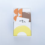
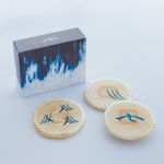
    This rebranding design for a long-established, Kyoto-based, traditional Japanese confectioner conveys the artistry of homemade desserts. The packaging uses the handwritten kanji character ‘seven’, part of the brand name, as the main visual element, and the logo is used on marketing materials from packaging to promotional leaflets.


    HIDAMARI Ltd.

    Close full details
    Share
    • Facebook
    • X
    • Pinterest
    • Tumblr
    • Email
    Previous
    |
    Next
    36 
    of  48

Facebook, opens in a new tab.
Instagram, opens in a new tab.
WeChat, opens in a new tab.
Youtube, opens in a new tab.
Manage cookies
Copyright @ 2022 Hong Kong Design Centre. All rights reserved.
Site by Artlogic

This website uses cookies
This site uses cookies to help make it more useful to you. Please contact us to find out more about our Cookie Policy.

Manage cookies
Accept

Cookie preferences

Check the boxes for the cookie categories you allow our site to use

Cookie options
Required for the website to function and cannot be disabled.
Improve your experience on the website by storing choices you make about how it should function.
Allow us to collect anonymous usage data in order to improve the experience on our website.
Allow us to identify our visitors so that we can offer personalised, targeted marketing.
Save preferences