
Muroran Uzuraen
arica design inc. / 日本
Further images
-
(View a larger image of thumbnail 1
)
-
(View a larger image of thumbnail 2
)

-
(View a larger image of thumbnail 3
)

-
(View a larger image of thumbnail 4
)
-
(View a larger image of thumbnail 5
)
-
(View a larger image of thumbnail 6
)
-
(View a larger image of thumbnail 7
)

-
(View a larger image of thumbnail 8
)

-
(View a larger image of thumbnail 9
)
-
(View a larger image of thumbnail 10
)


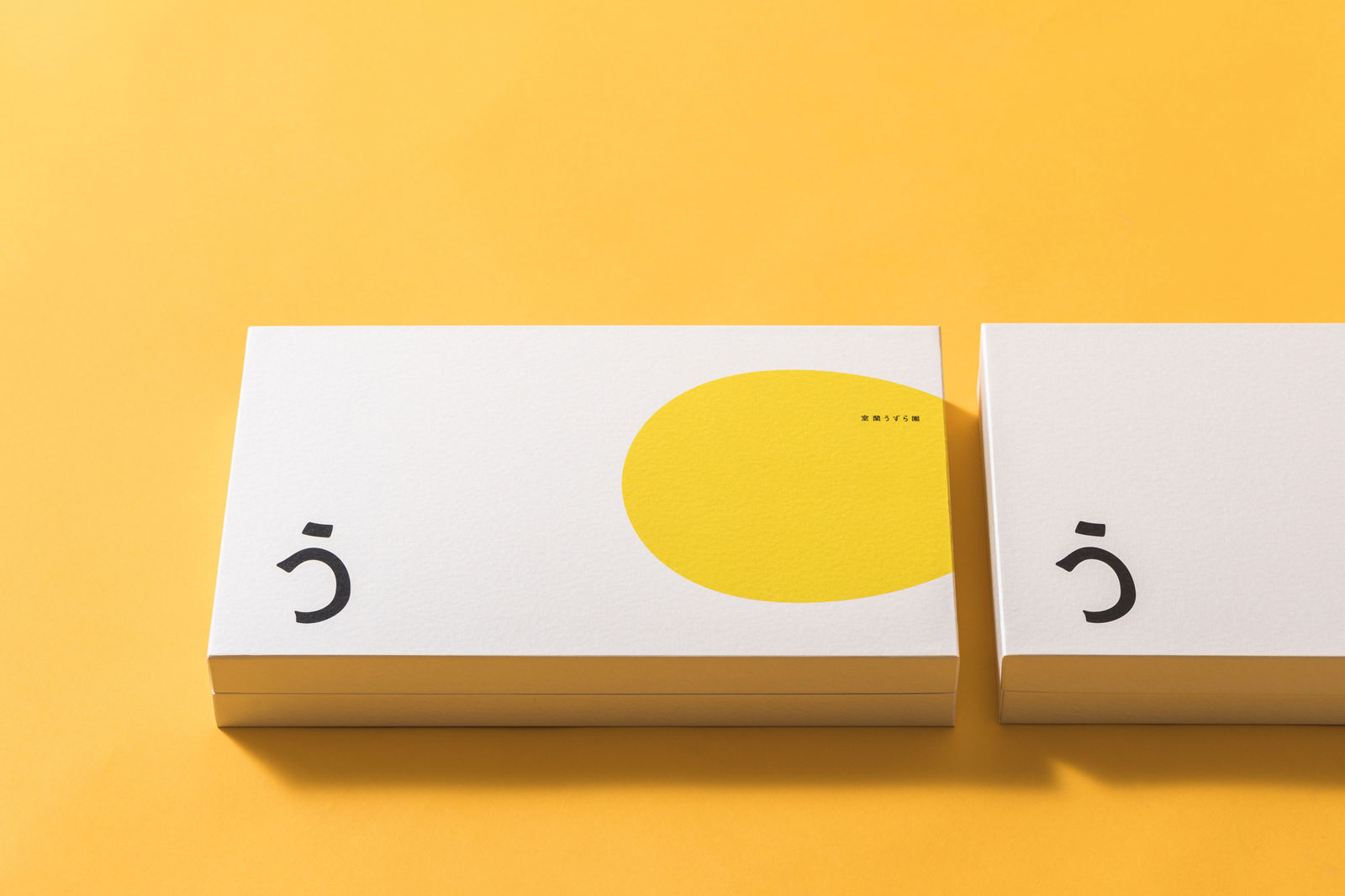
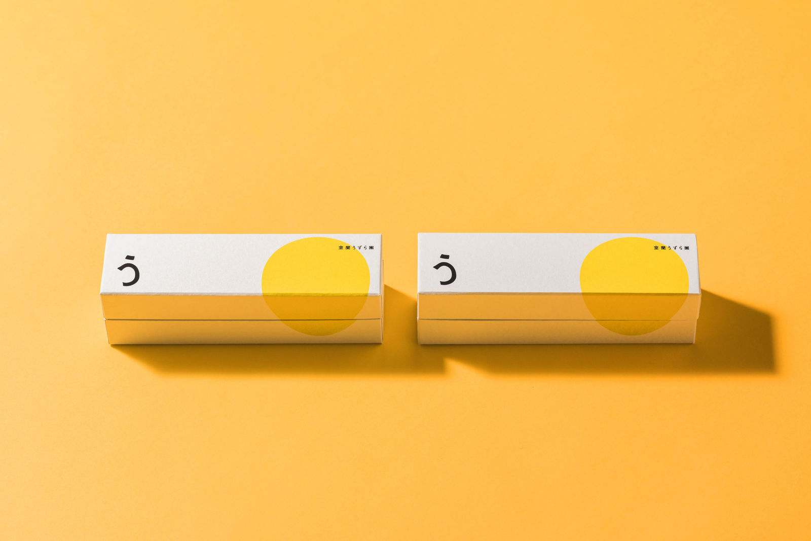
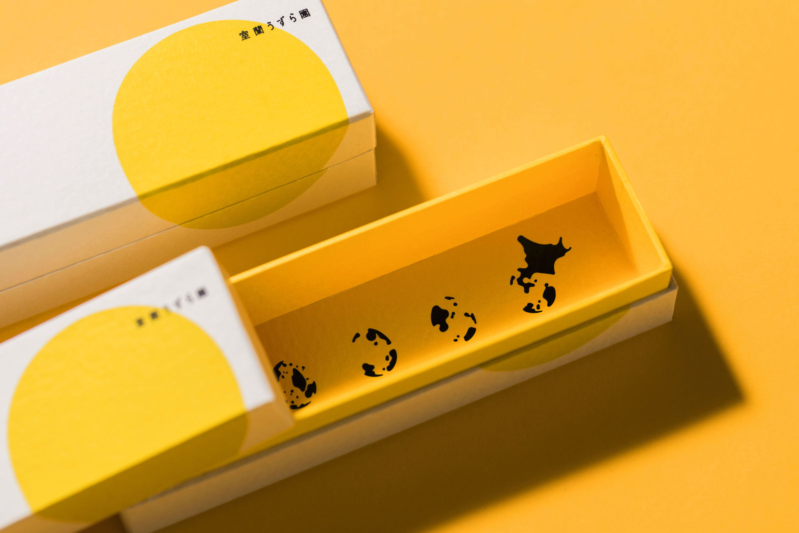
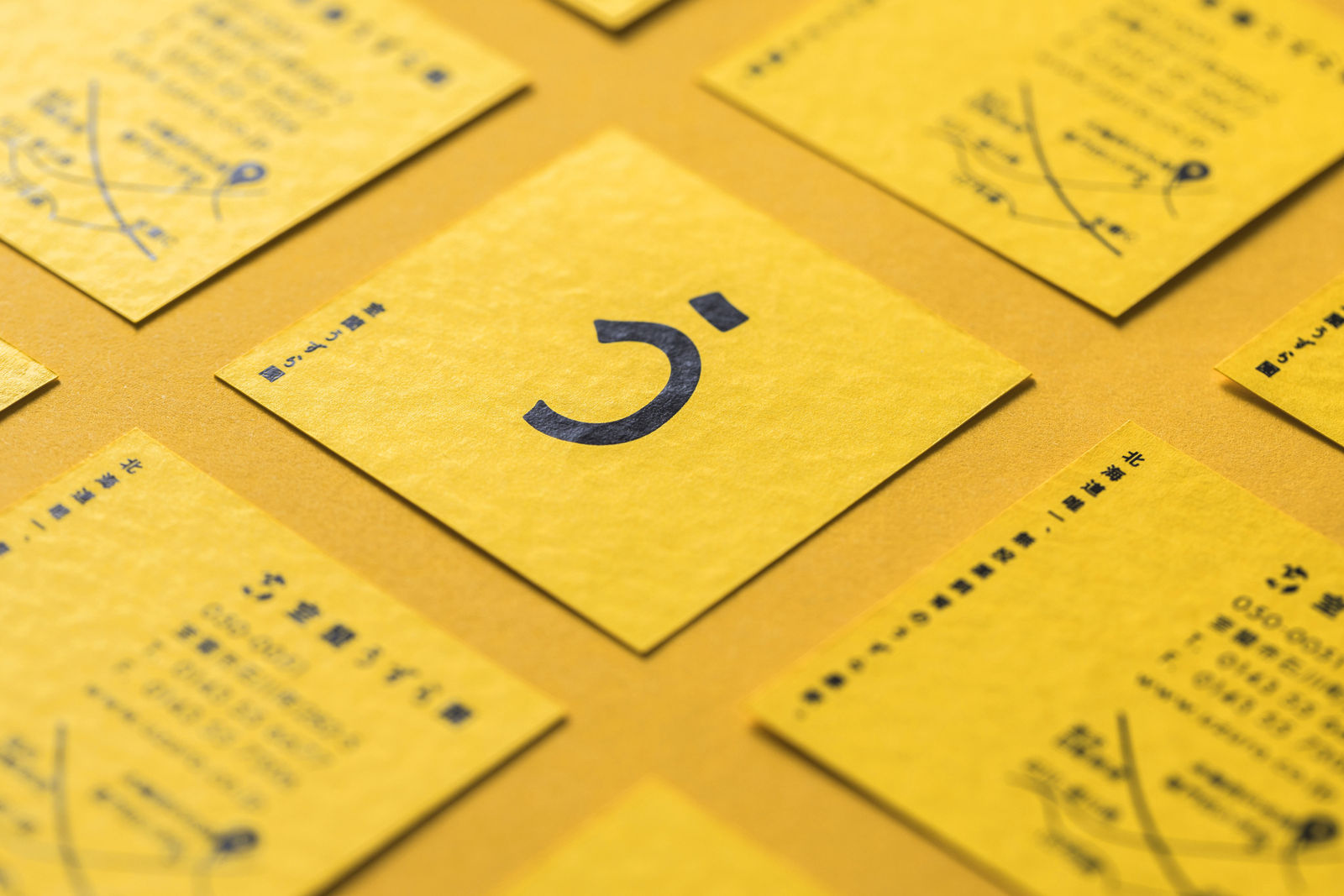
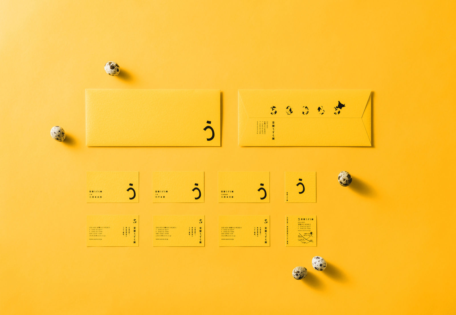
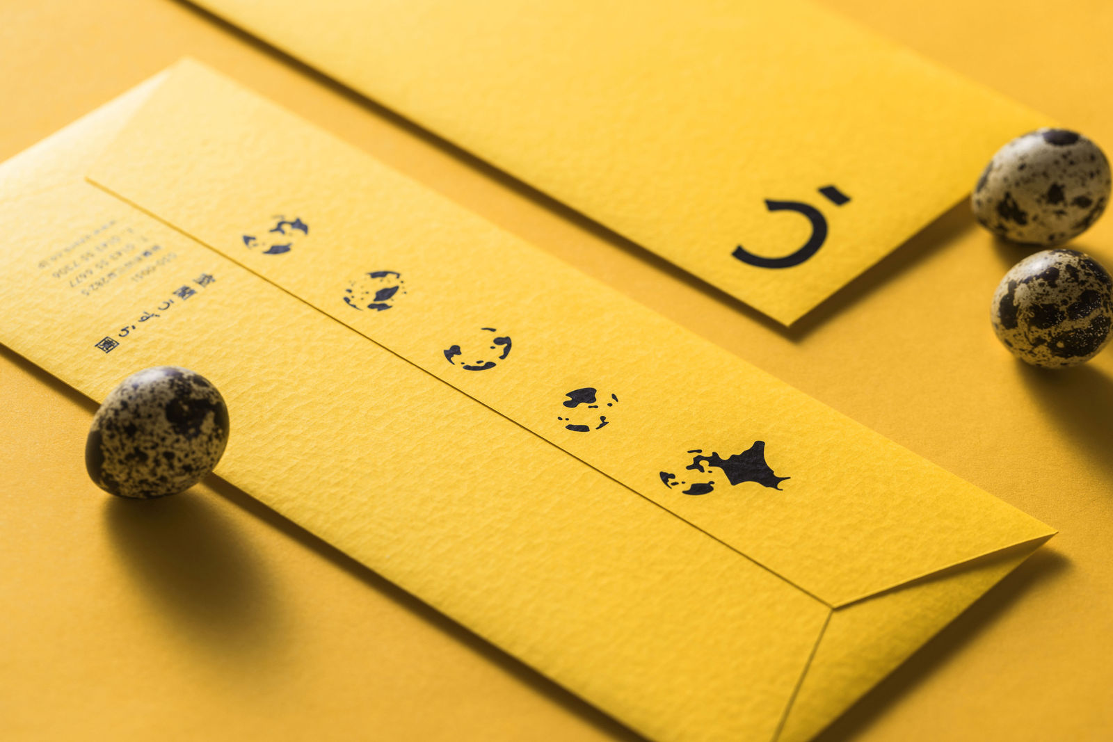
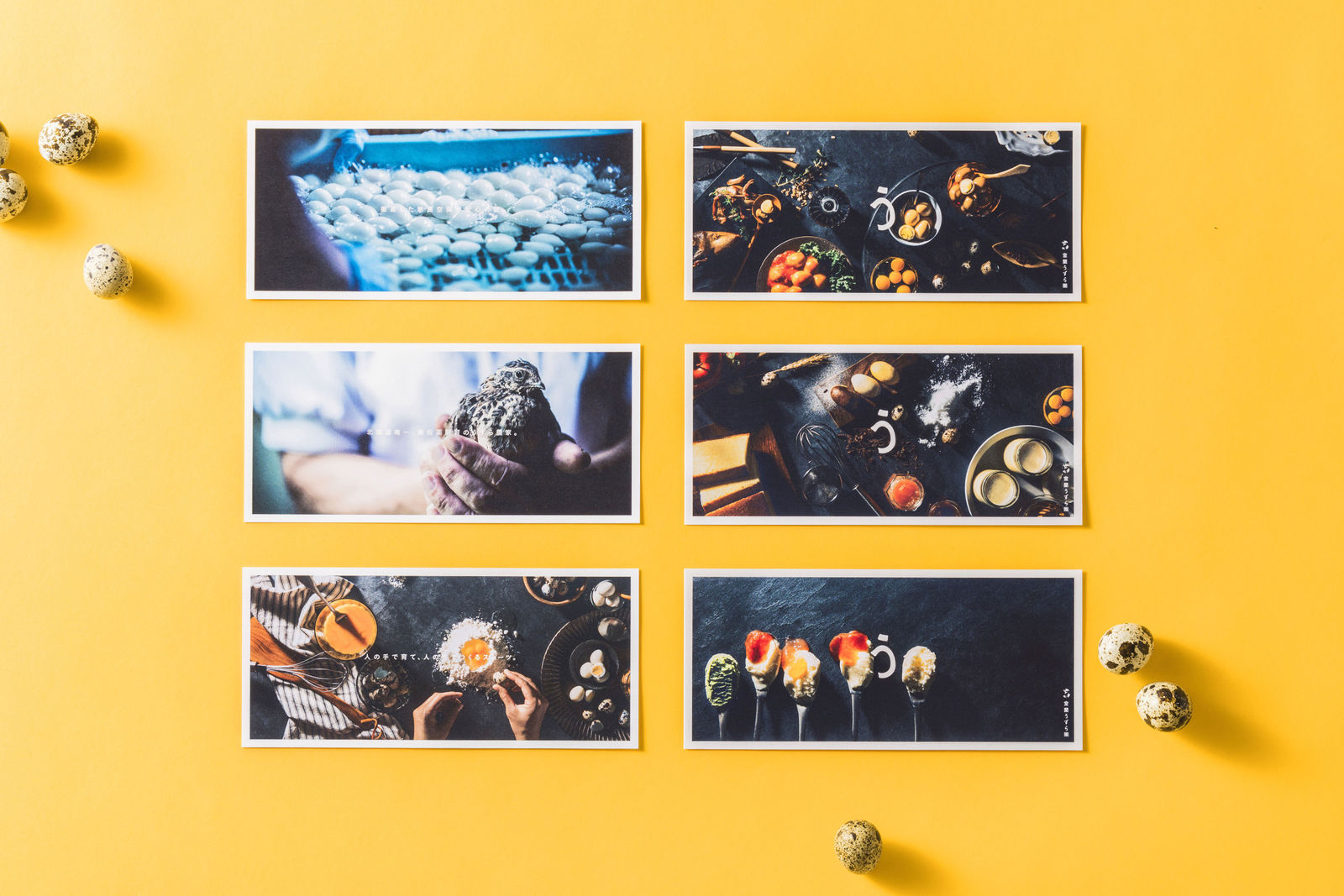
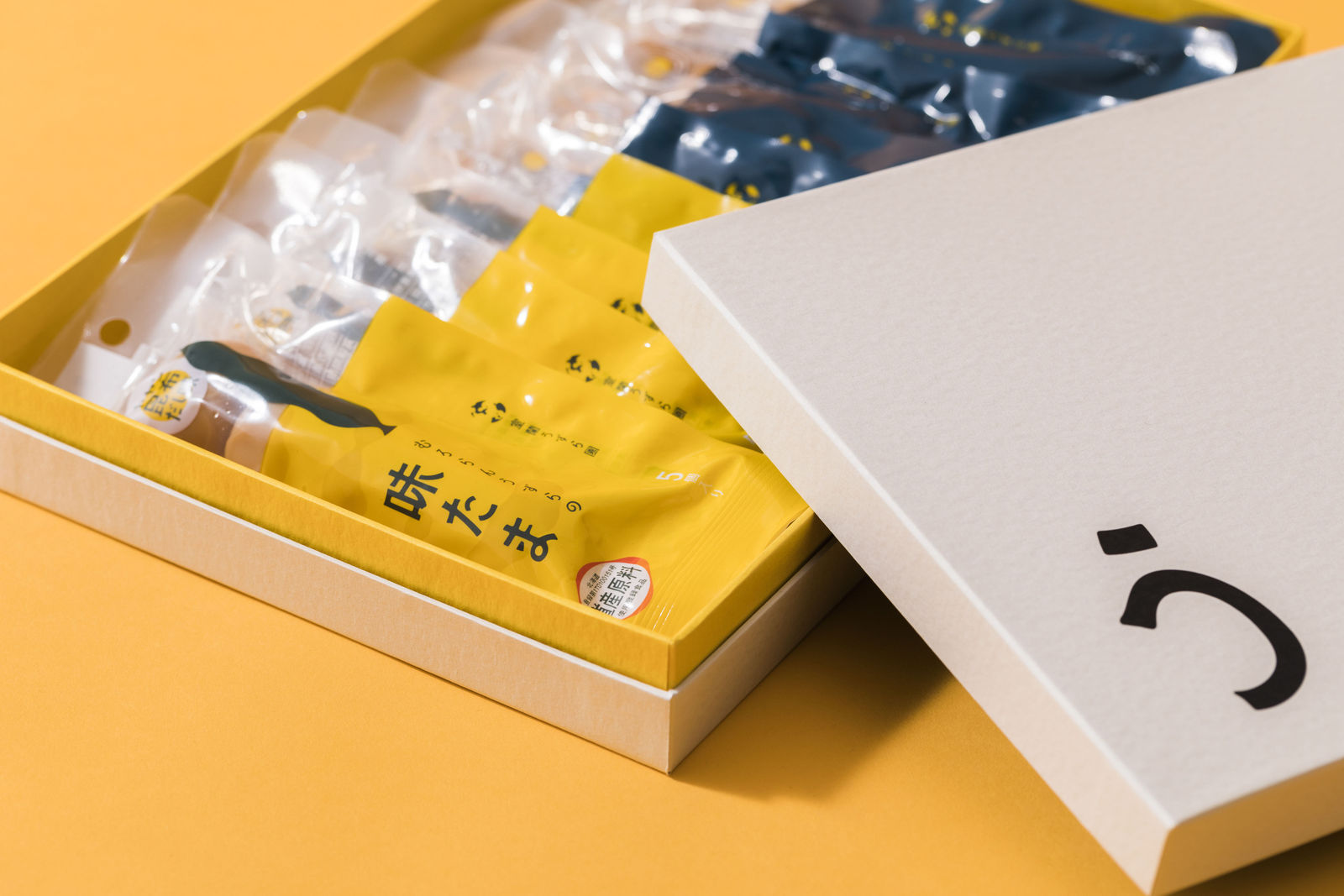
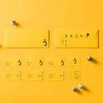
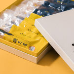
DFA亞洲最具影響力設計獎 2020 l 銅獎 l 傳訊設計 | 形象及品牌

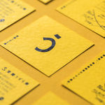
以日本平假名「う」為主要設計元素,稍作修改後成為鵪鶉蛋的形狀,作為商標印刷於不同的宣傳品。另外,包裝上產地的農場地圖是由設計師抽象化鵪鶉蛋殻上的花紋而成。包裝紙採用天然紋理紙,帶出有機產品的新鮮特質。

