
Aoyama Ototo
bluelake inc. / 日本
Further images
-
(View a larger image of thumbnail 1
)
-
(View a larger image of thumbnail 2
)

-
(View a larger image of thumbnail 3
)

-
(View a larger image of thumbnail 4
)
-
(View a larger image of thumbnail 5
)
-
(View a larger image of thumbnail 6
)
-
(View a larger image of thumbnail 7
)

-
(View a larger image of thumbnail 8
)

-
(View a larger image of thumbnail 9
)
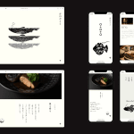


DFA亞洲最具影響力設計獎 2024 l 銀獎 l 傳訊設計 | 形象及品牌

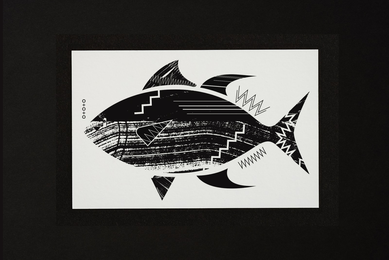
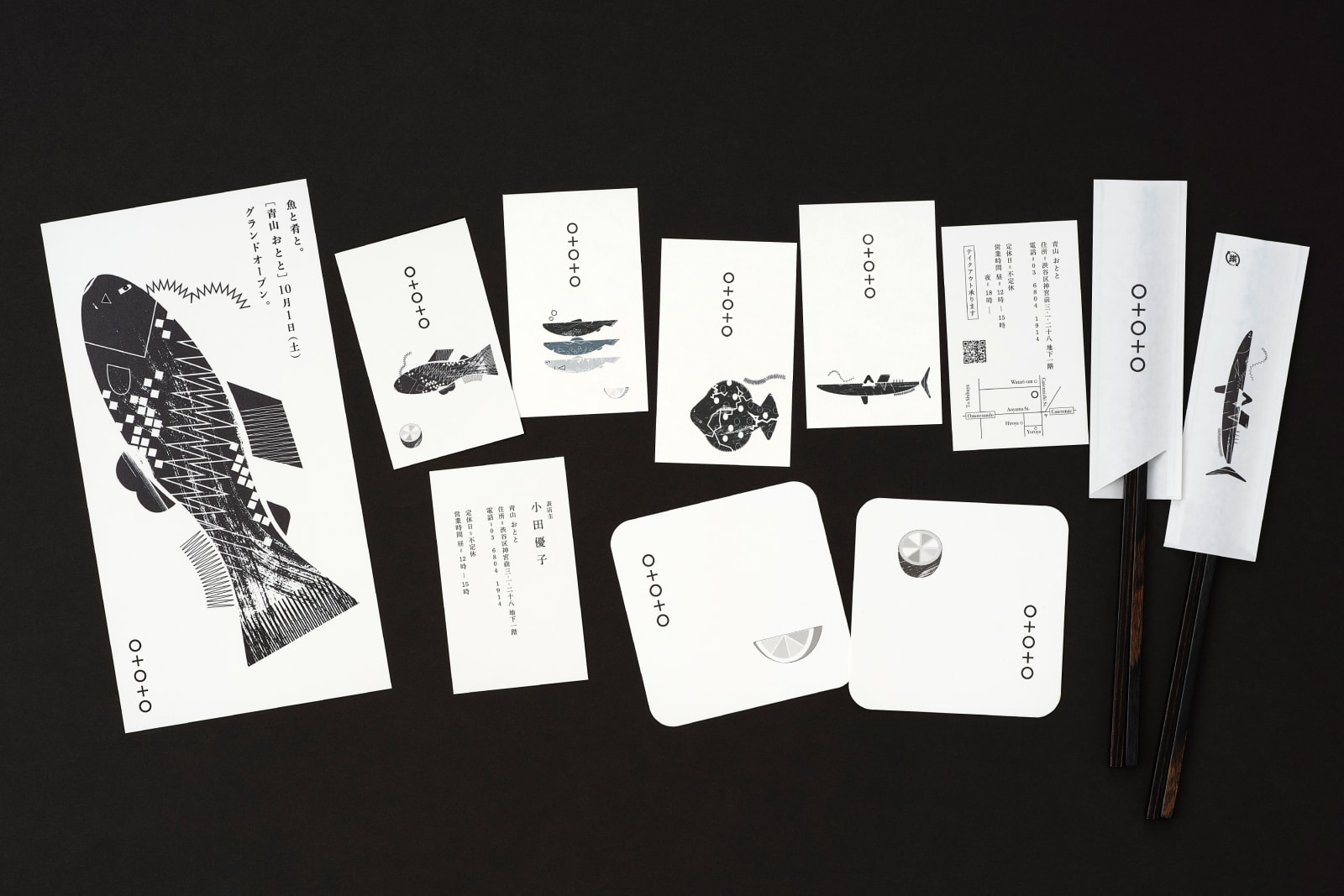
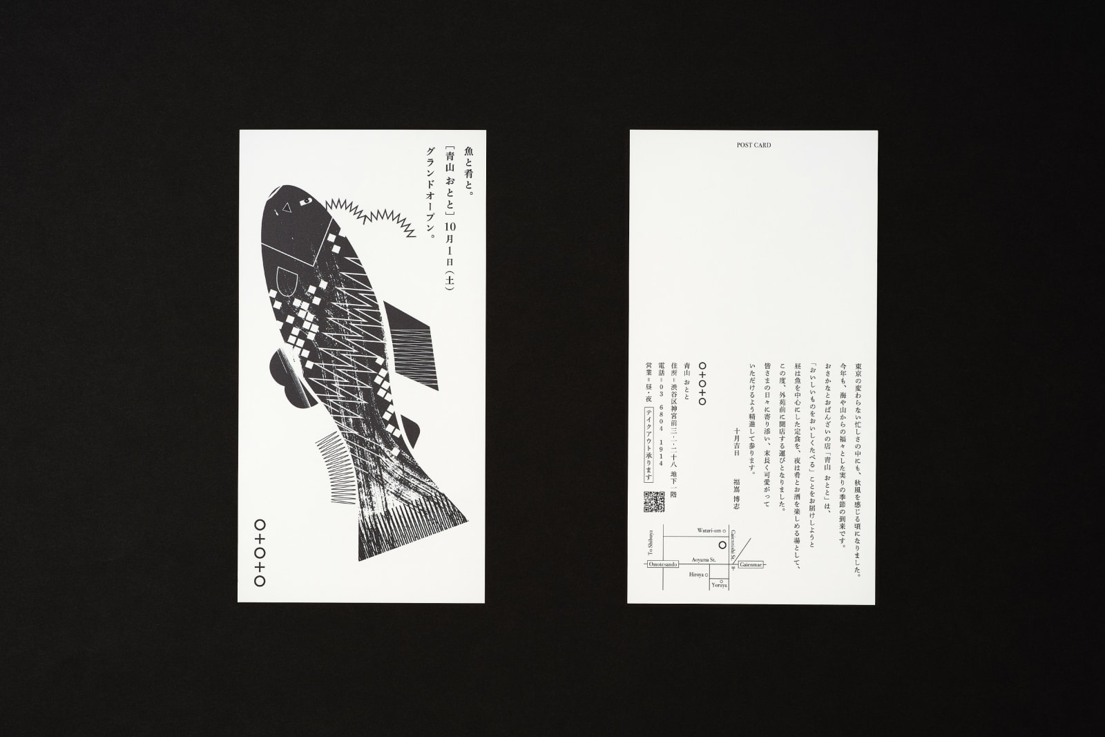
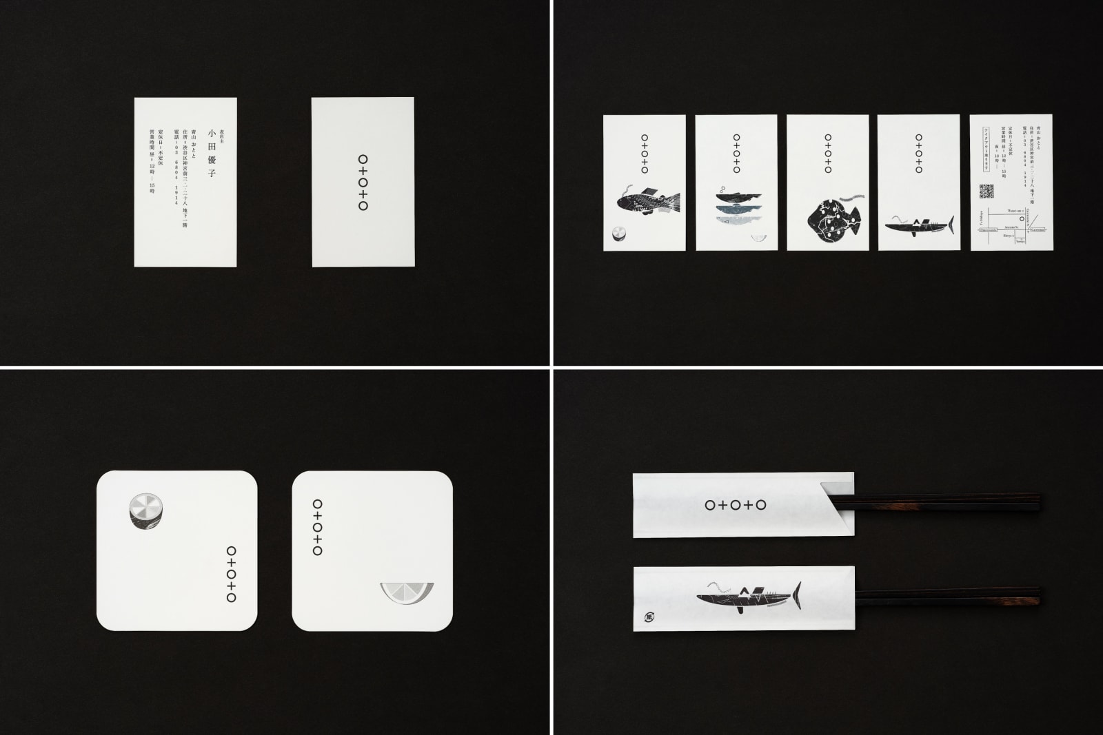
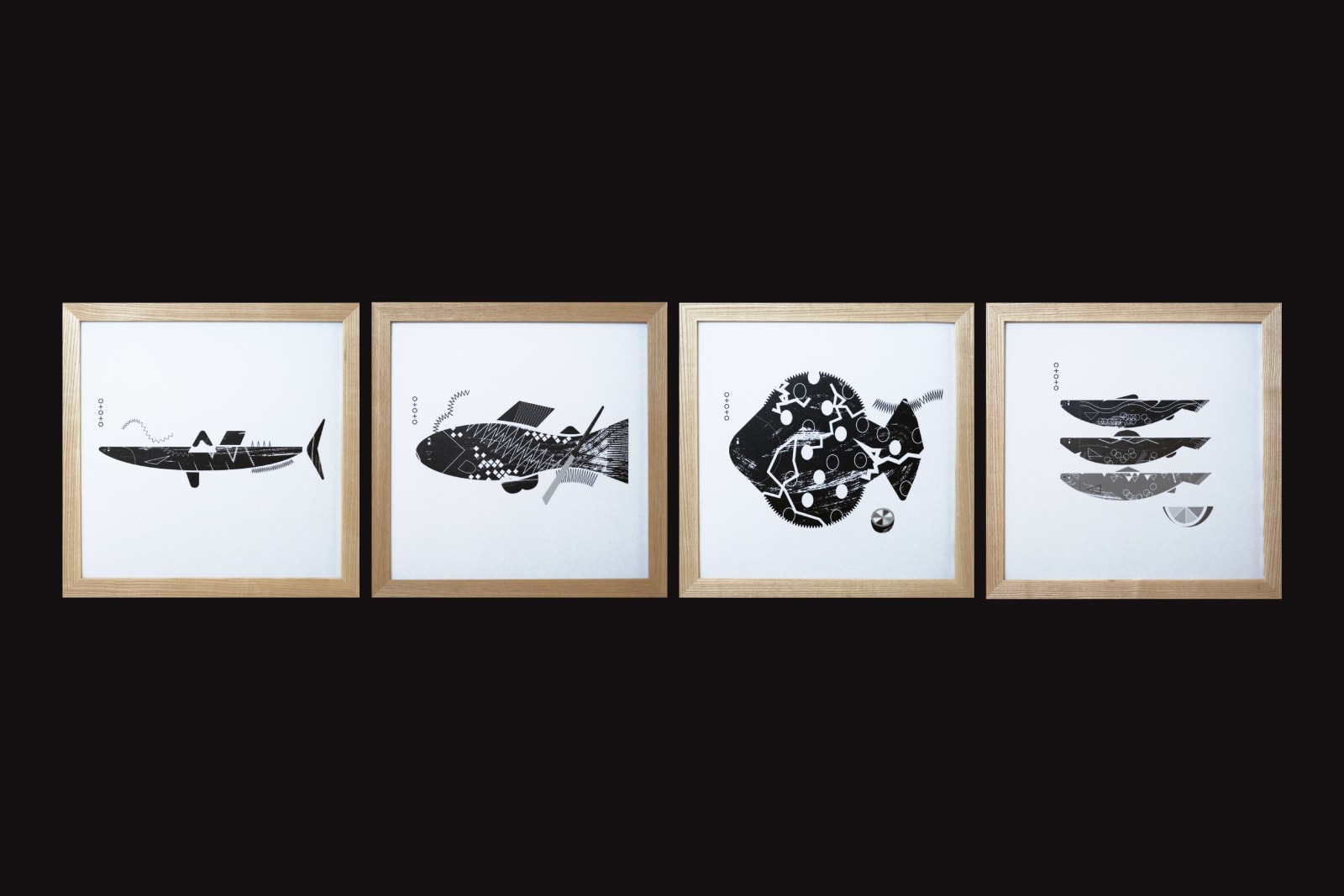
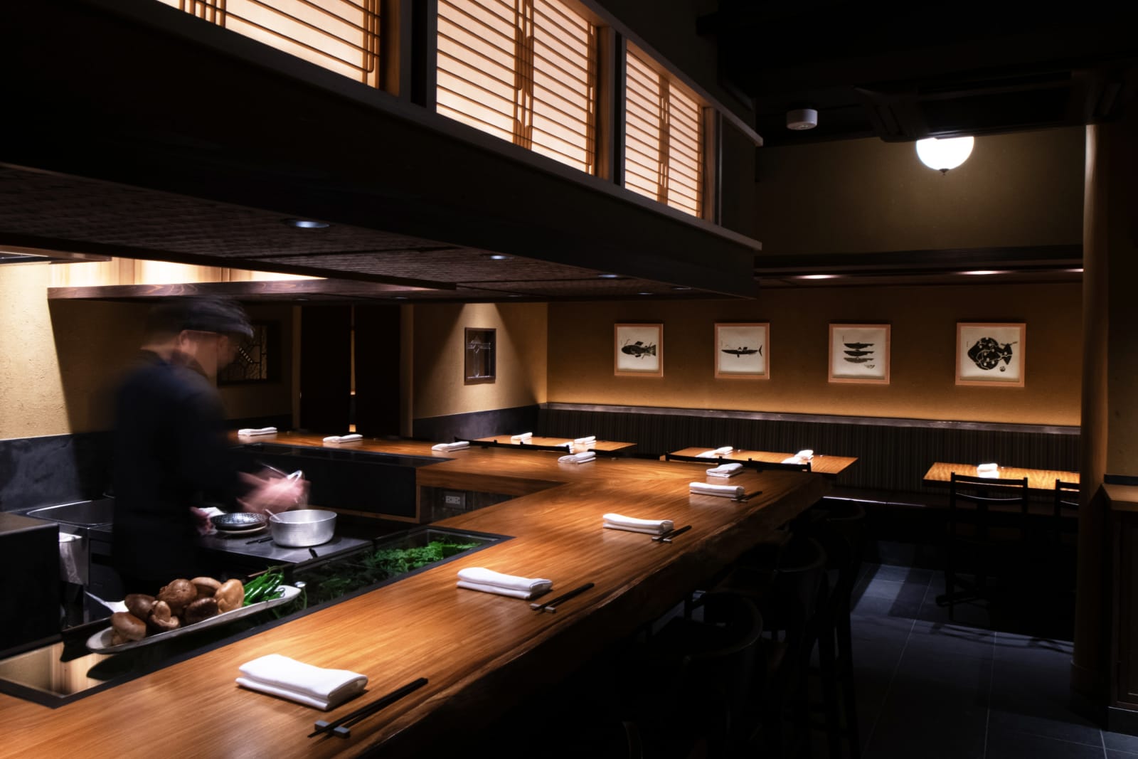
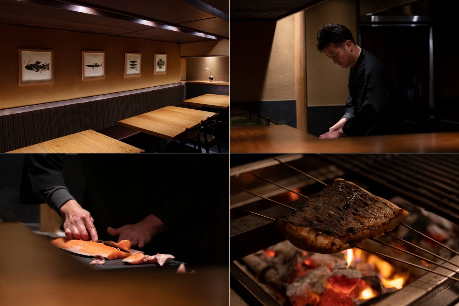
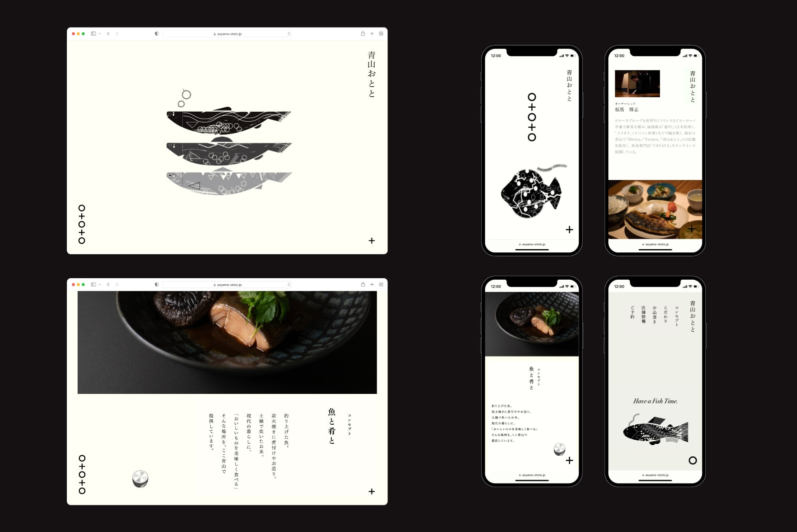
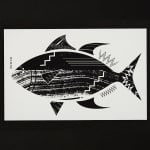
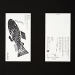
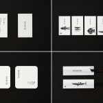
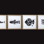
黑白玩味
Aoyama Ototo 的傳訊設計巧妙平衡傳統與現代玩味。插畫家川島直人以傳統魚印畫「魚拓」為靈感,創作出一系列「Toto Art」作為品牌形象核心,呼應餐廳的招牌炭火烤魚菜式。這種黑白藝術與內歛細膩的室內裝潢形成鮮明對比,為餐廳增添一分玩味感,在年輕顧客和國際旅客間廣受好評。網站設計亦圍繞這視覺體驗,模擬魚拓印在屏幕上的效果,每次均隨機顯示不同的魚類圖片。連貫的主題式設計策略有助增加餐廳客流,助其成功入選2023年米芝蓮指南。