-
Artworks

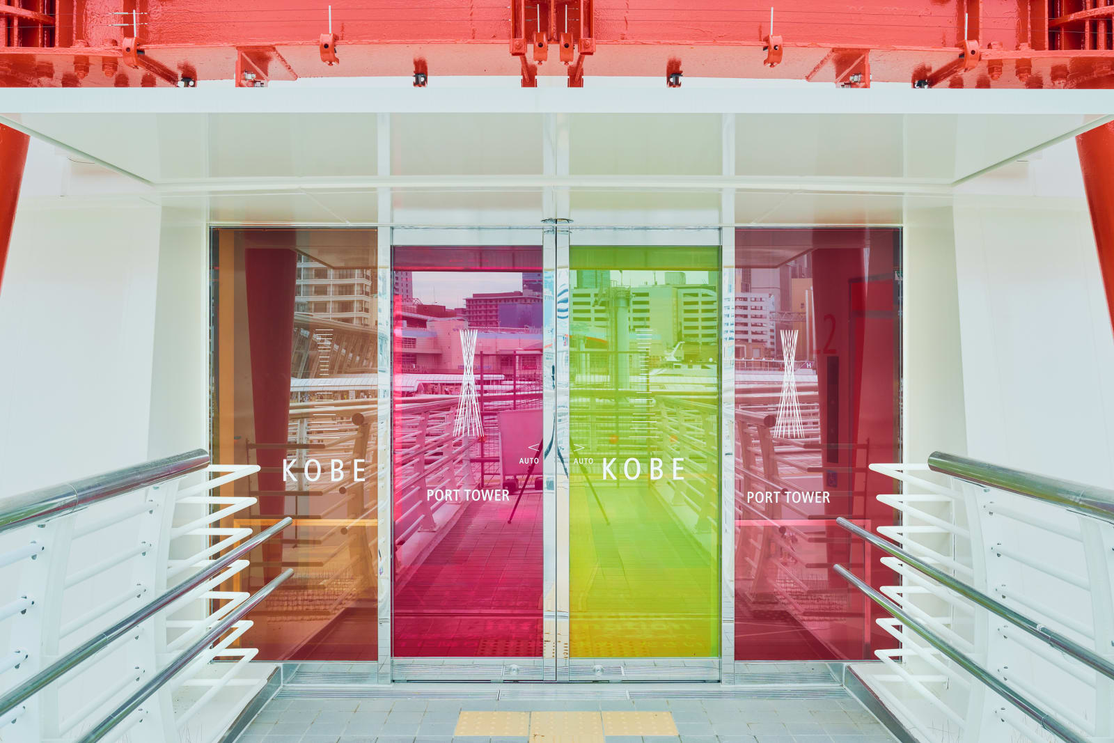
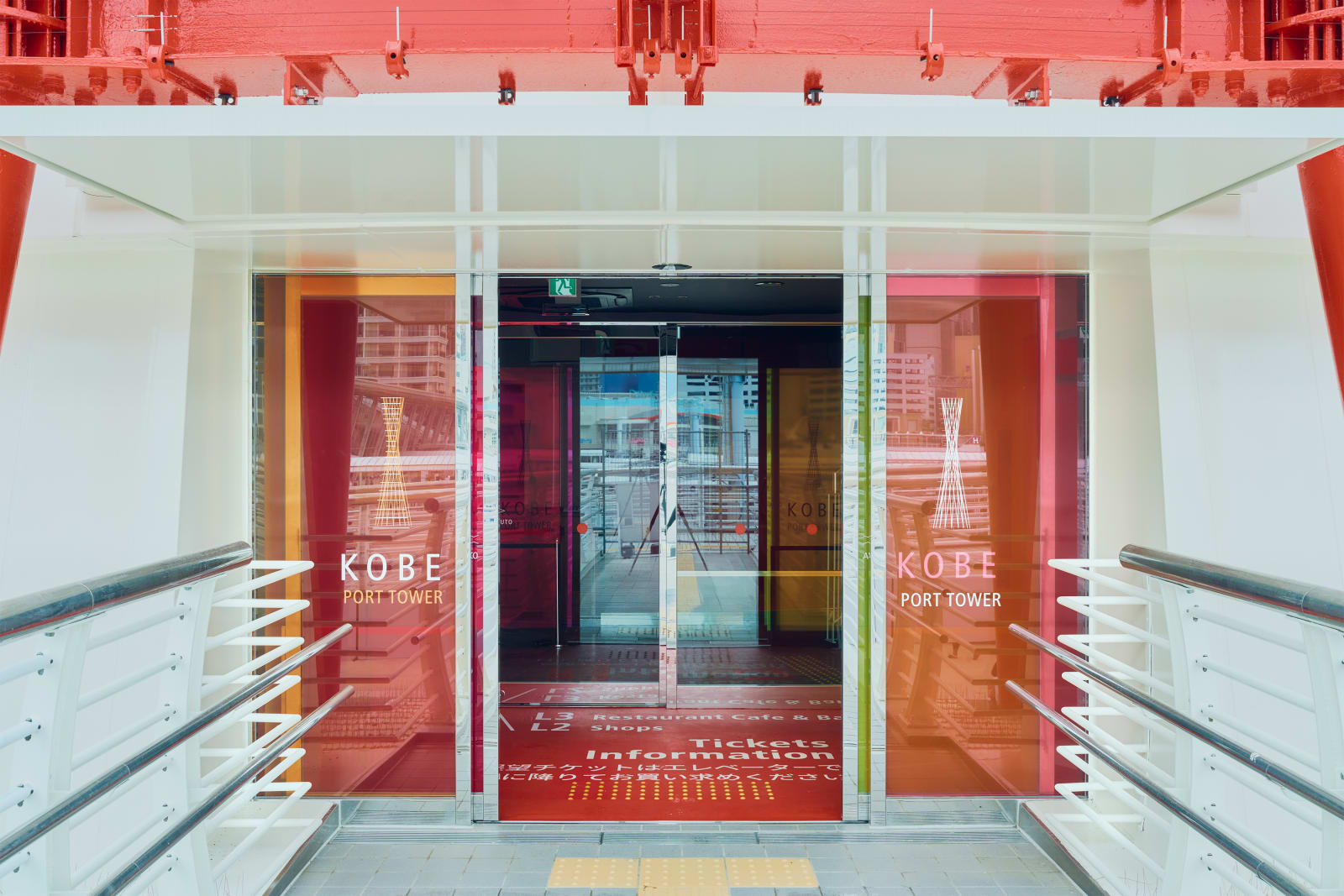
KOBE PORT TOWER
MOTIVE Inc. / JapanFurther images
-
(View a larger image of thumbnail 1
)

-
(View a larger image of thumbnail 2
)

-
(View a larger image of thumbnail 3
)

-
(View a larger image of thumbnail 4
)

-
(View a larger image of thumbnail 5
)

-
(View a larger image of thumbnail 6
)

-
(View a larger image of thumbnail 7
)

-
(View a larger image of thumbnail 8
)

-
(View a larger image of thumbnail 9
)
-
(View a larger image of thumbnail 10
)

DFA Design for Asia Awards 2025 l Merit Award l Communication Design | Identity & Branding
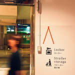
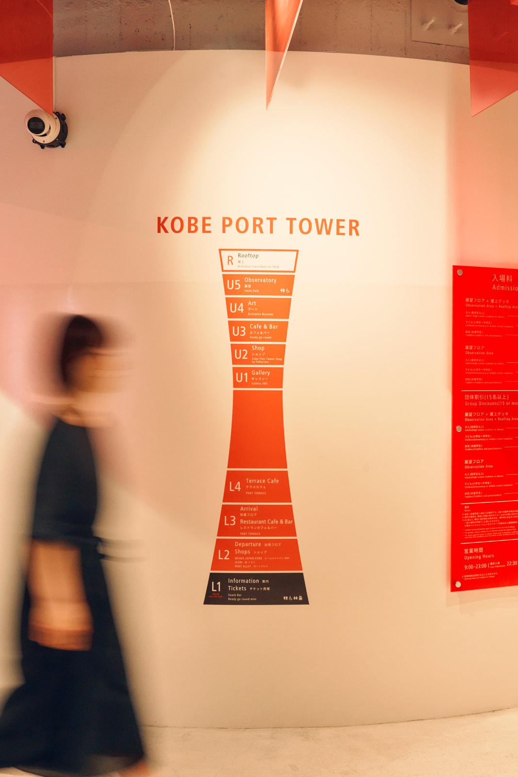
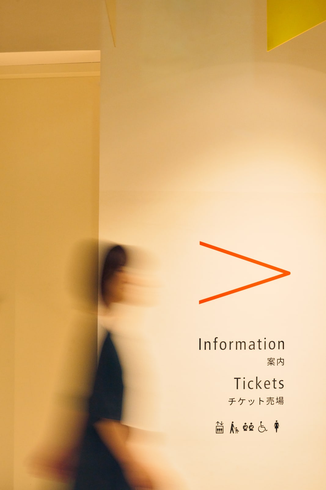
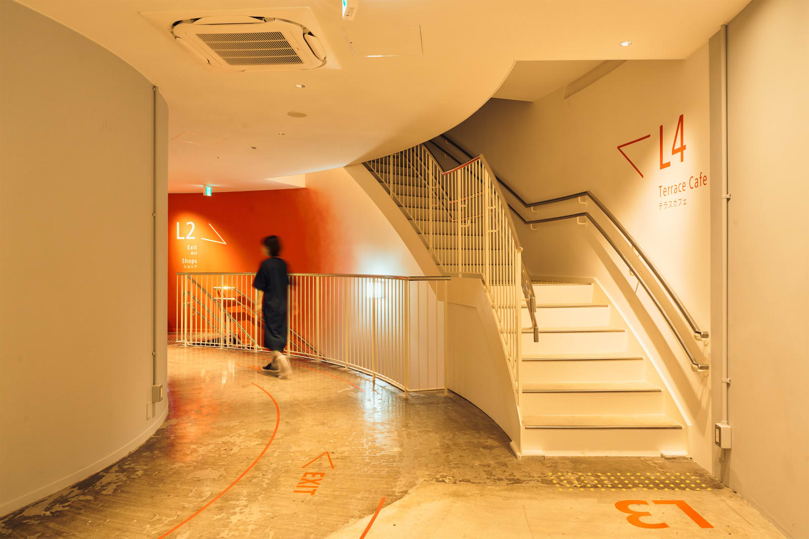
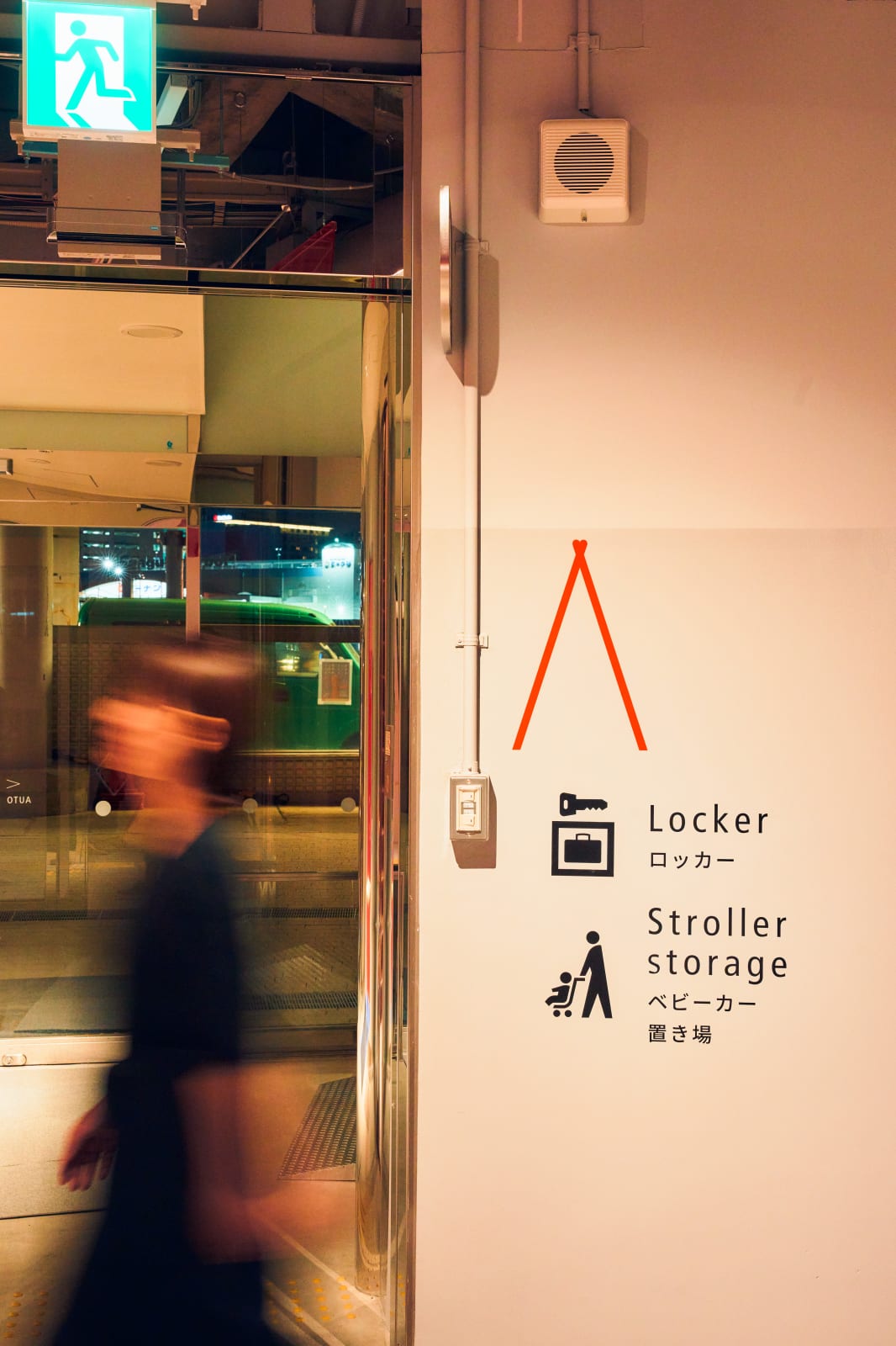
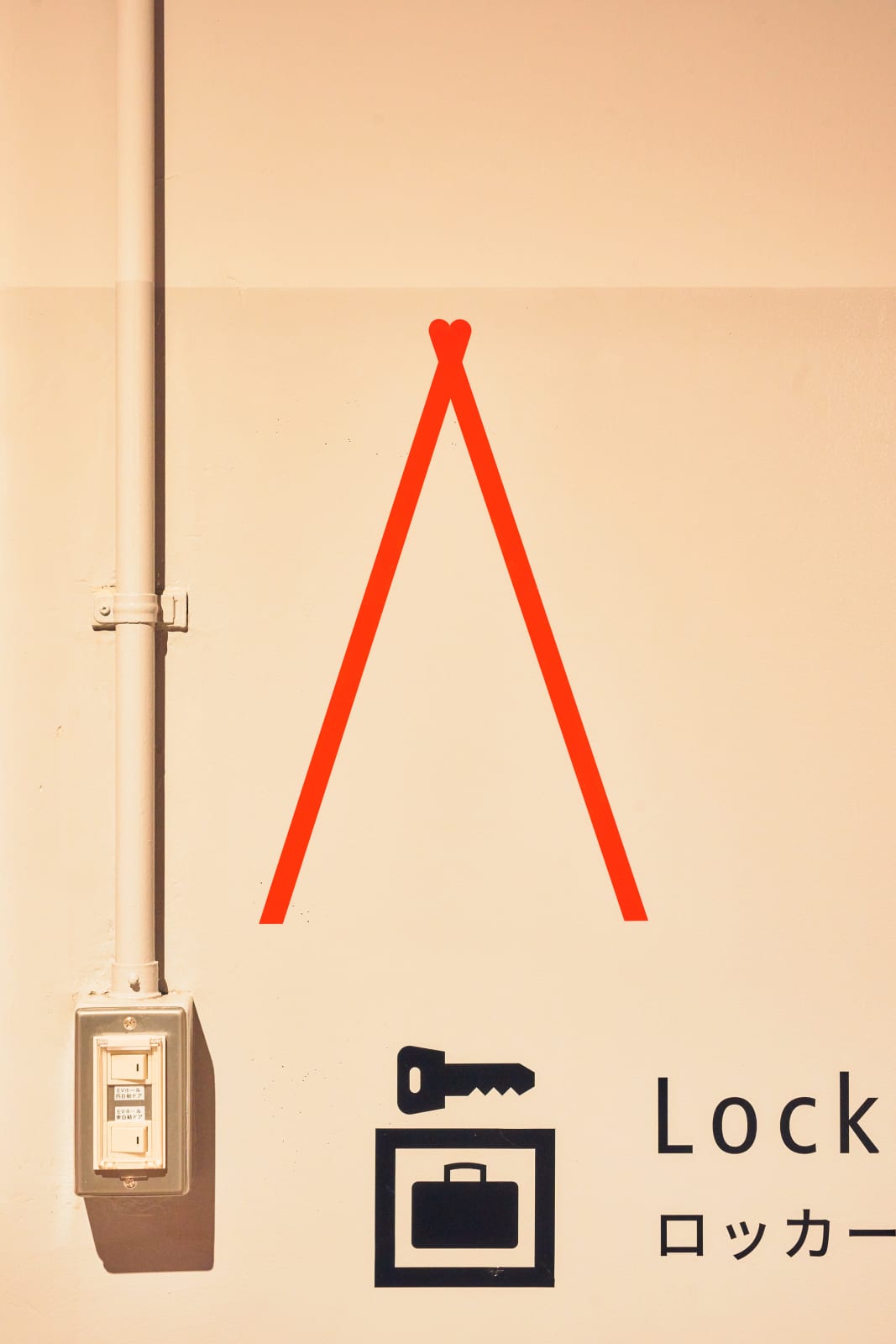
Beacon of Red
Drawing from the Port Tower’s symbolic glow after the Great Hanshin-Awaji Earthquake, the wayfinding design channels its radiant red as a guiding force. Through gradated hues, tubular arrows, and subtle heart motifs, movement becomes intuitive—while floor guides shaped like the tower’s silhouette anchor orientation in memory, transforming navigation into an emotional journey of hope and warmth.
-
(View a larger image of thumbnail 1
)


![]()
![]()