-
Artworks


EasyGo Brand Identity
Chengdu Mifang Culture Communication Co.,Ltd. (Find Design) / The MainlandFurther images
-
(View a larger image of thumbnail 1
)

-
(View a larger image of thumbnail 2
)

-
(View a larger image of thumbnail 3
)

-
(View a larger image of thumbnail 4
)

-
(View a larger image of thumbnail 5
)

-
(View a larger image of thumbnail 6
)

-
(View a larger image of thumbnail 7
)

-
(View a larger image of thumbnail 8
)

-
(View a larger image of thumbnail 9
)

DFA Design for Asia Awards 2024 l Merit Award l Communication Design | Identity & Branding
Upward Arc
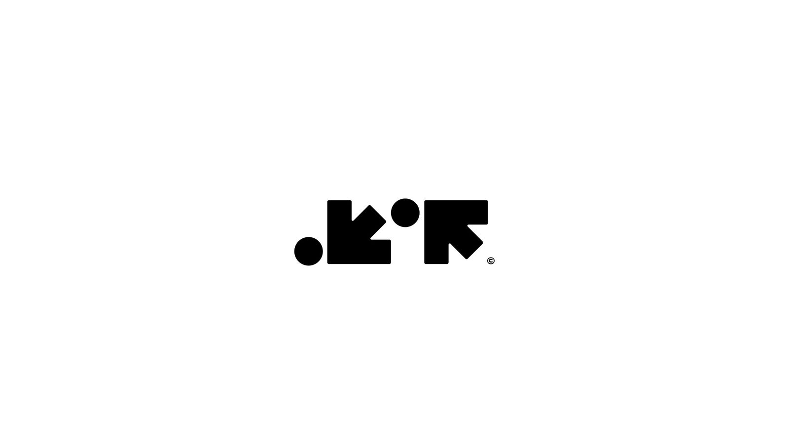
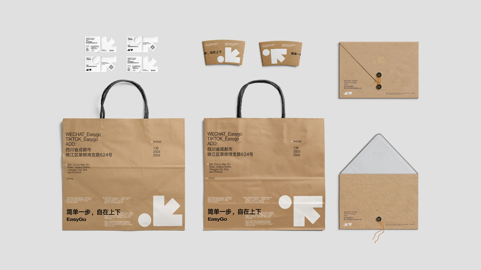
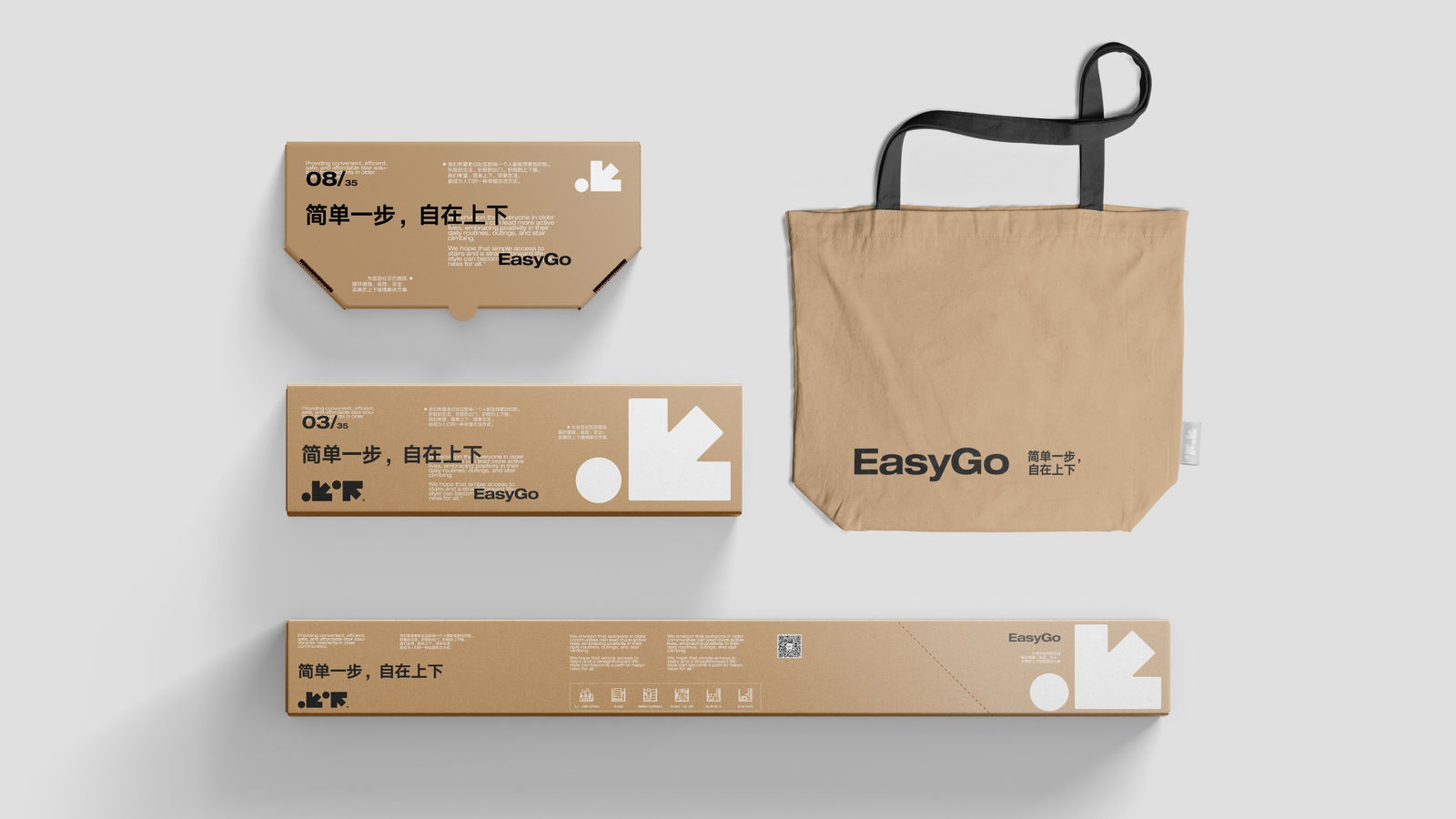
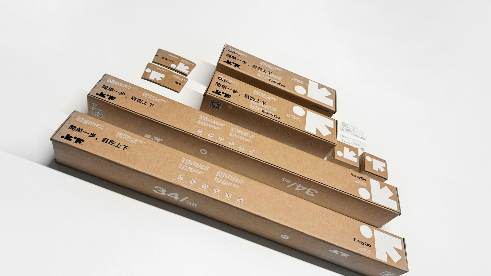
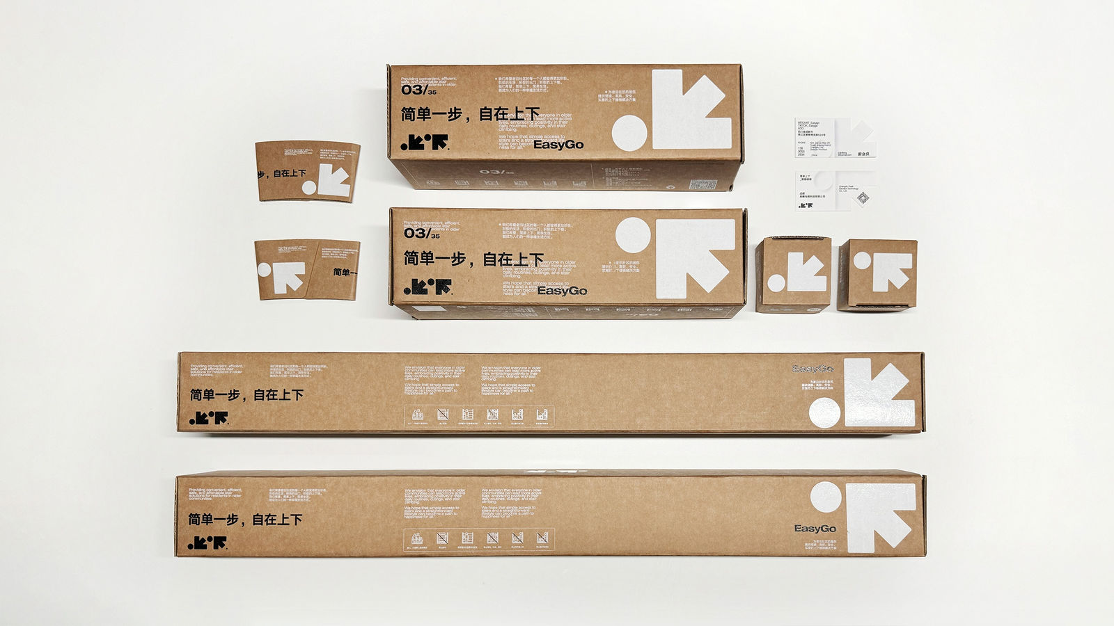
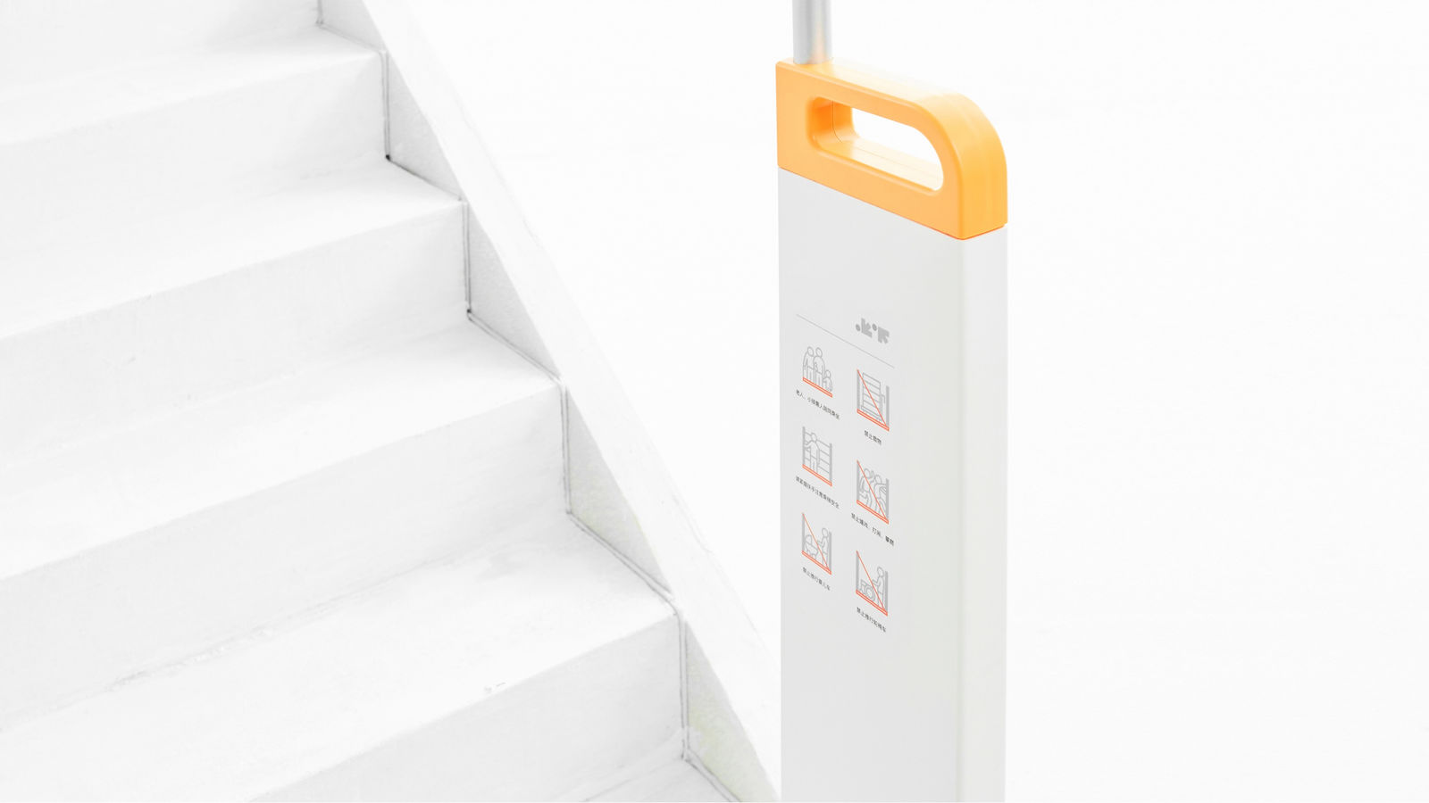
Inspired by the concepts of arrows and circles, this elevator brand’s visual identity playfully symbolises upward and downward movement, paired with vitality. The minimalist design incorporates Chinese characters for ‘up’ and ‘down’ while using eco-friendly materials, embodying simplicity and sustainability. -
(View a larger image of thumbnail 1
)

