-
Artworks

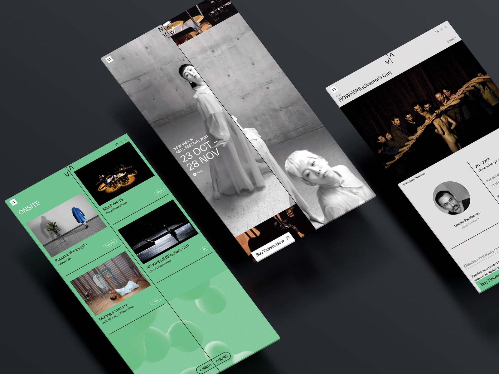
New Vision Arts Festival 2021
CoDesign Ltd / Hong KongFurther images
-
(View a larger image of thumbnail 1
)

-
(View a larger image of thumbnail 2
)

-
(View a larger image of thumbnail 3
)

-
(View a larger image of thumbnail 4
)

-
(View a larger image of thumbnail 5
)

-
(View a larger image of thumbnail 6
)

-
(View a larger image of thumbnail 7
)

-
(View a larger image of thumbnail 8
)

-
(View a larger image of thumbnail 9
)

DFA Design for Asia Awards 2022 l Silver Award l Communication Design | Marketing Campaign
A Perfect Vision
The rebranding of New Vision rejuvenates an art festival that shows experimental and cross-disciplinary work. This concept is encapsulated in the wordplay of “ReNew Vision”, and the moving arrows that form the letter ‘N’. The festival's stylised early alphabets created a distinctive image and instantly recognisable colour scheme on both billboards and brochures, and the moving arrows and stylised letters can easily be used in different media. Grid lines hold essential information such as times and venues, and the visual system's flexibility represents the constantly evolving nature of the iconic festival, which, although it is much smaller in scale, has attracted much attention.
-
(View a larger image of thumbnail 1
)


![]()
![]()