
The Whal Myung Flagship Store / Korea
Jongkim Design Studio / Korea
Further images
-
(View a larger image of thumbnail 1
)
-
(View a larger image of thumbnail 2
)

-
(View a larger image of thumbnail 3
)

-
(View a larger image of thumbnail 4
)

-
(View a larger image of thumbnail 5
)

-
(View a larger image of thumbnail 6
)

-
(View a larger image of thumbnail 7
)

-
(View a larger image of thumbnail 8
)

-
(View a larger image of thumbnail 9
)

-
(View a larger image of thumbnail 10
)

-
(View a larger image of thumbnail 11
)


DFA Design for Asia Awards 2020 l Bronze Award l Environmental Design | Retail & Showroom Spaces

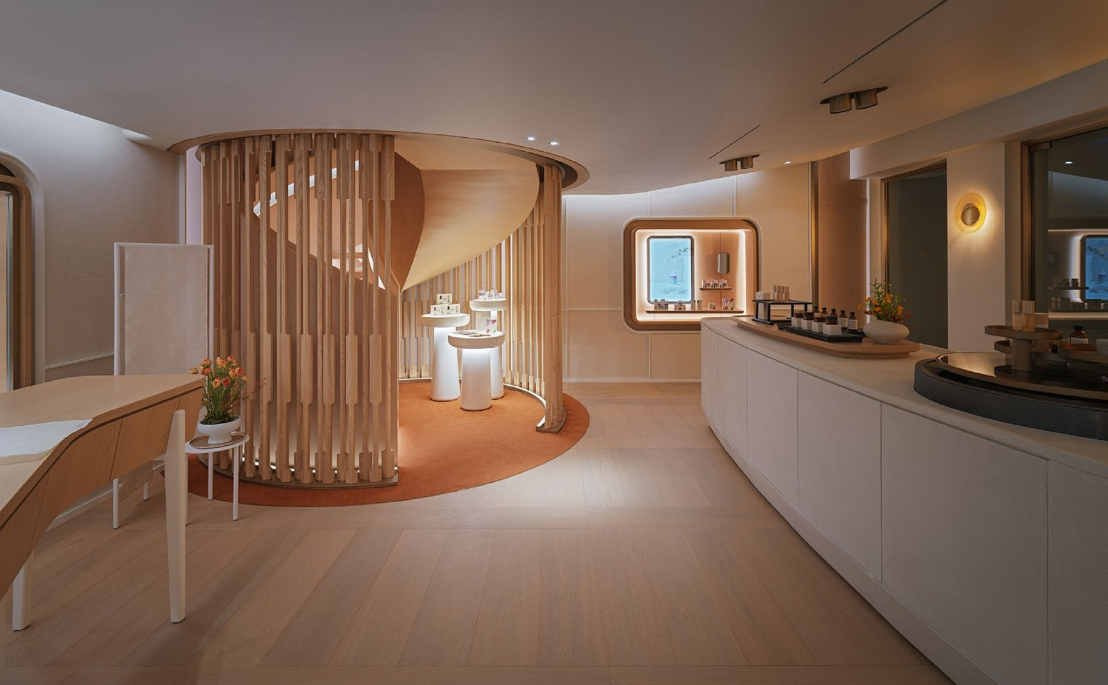
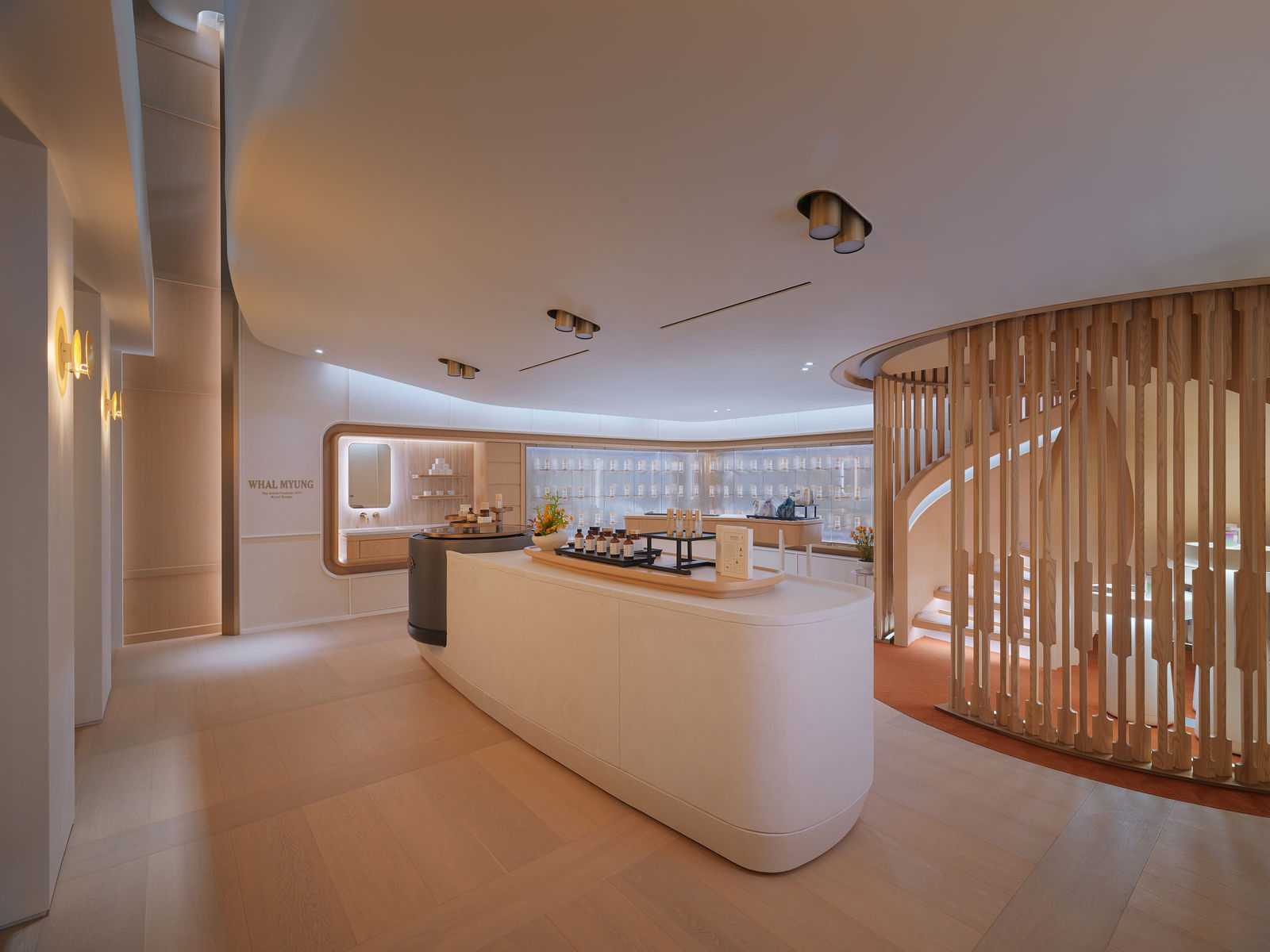
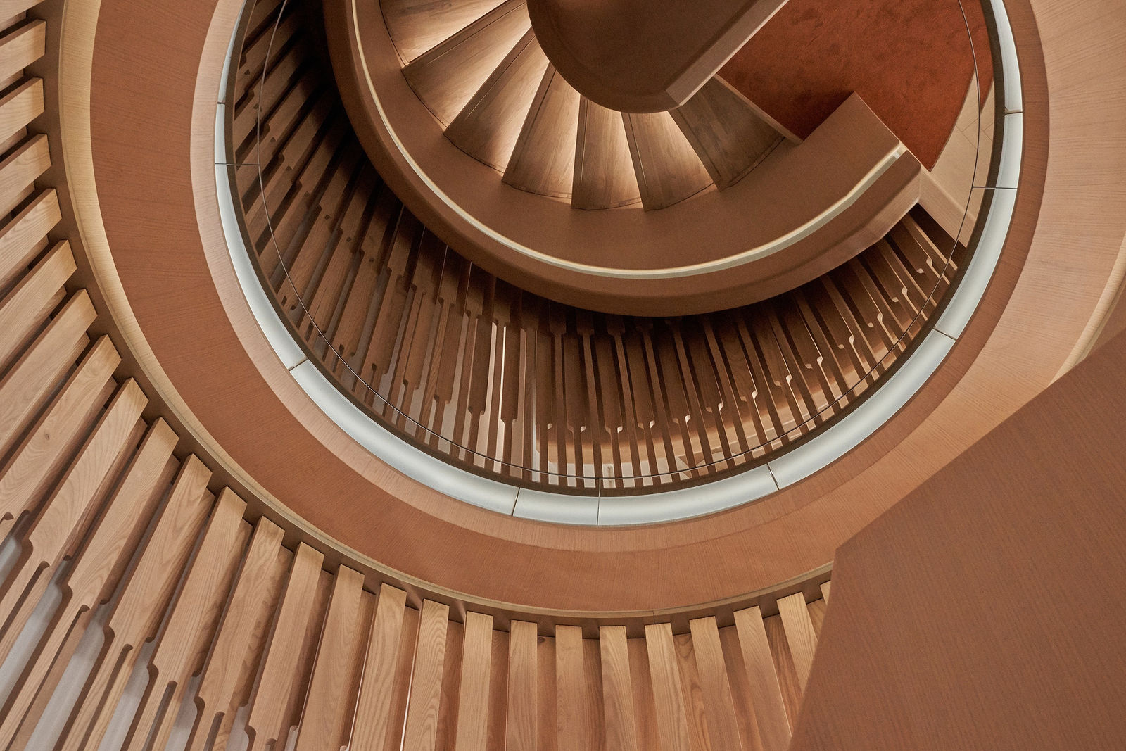
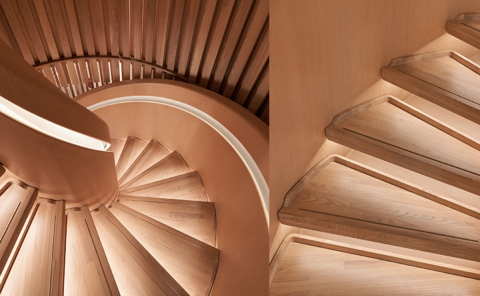
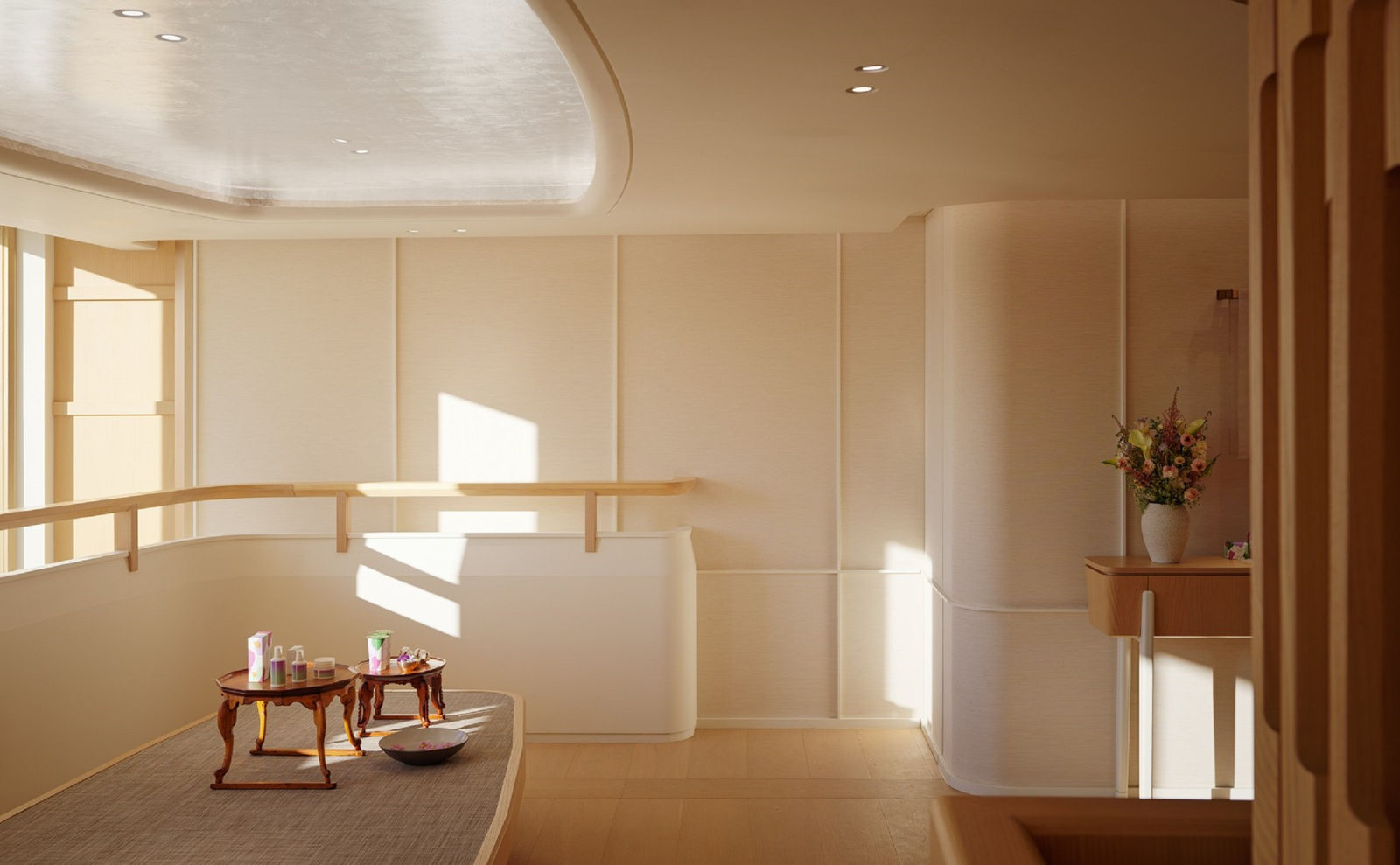
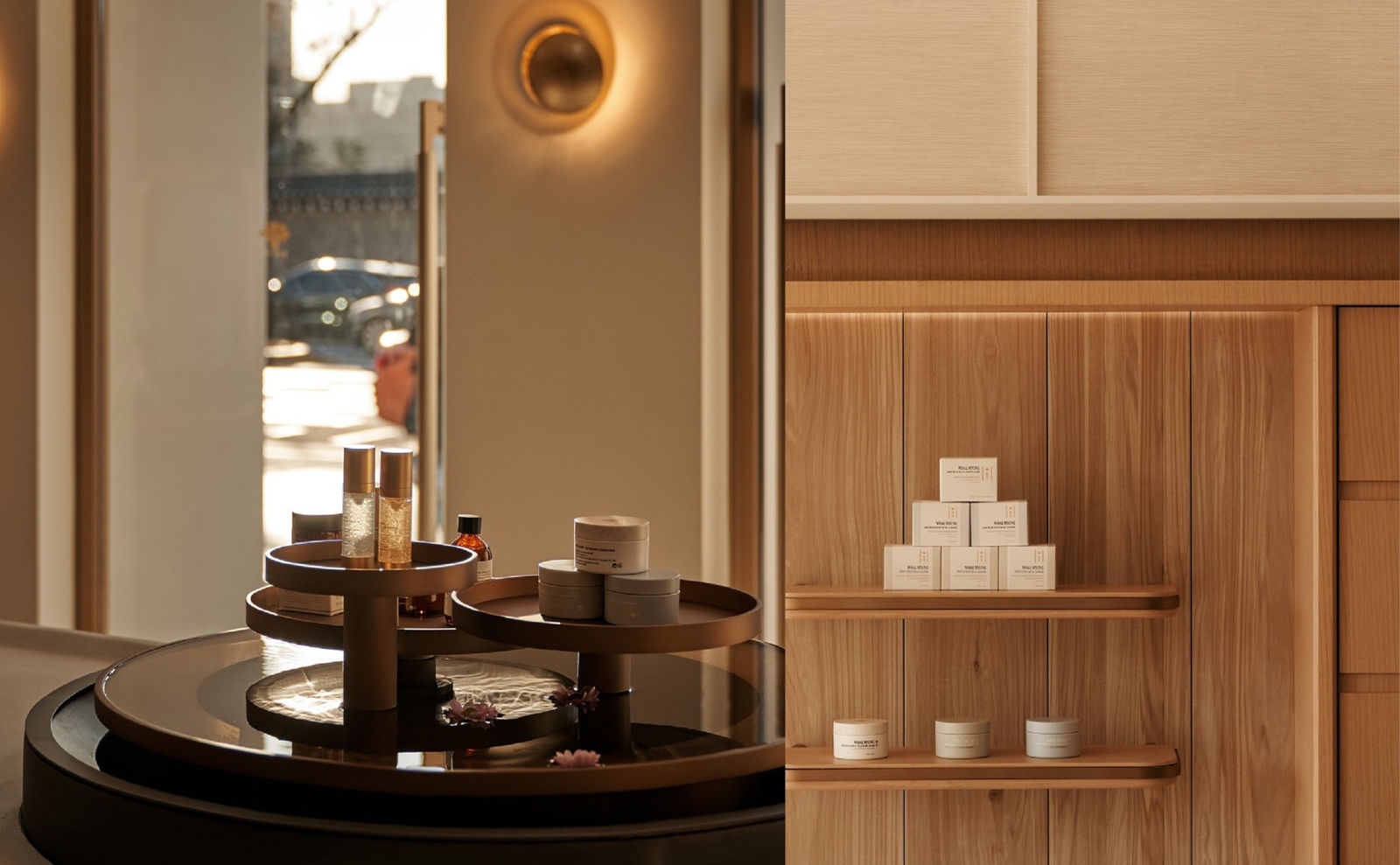
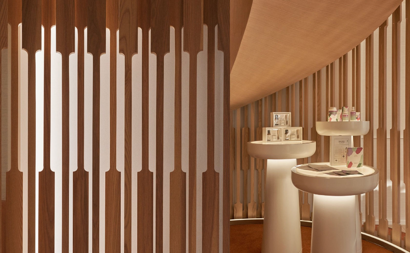
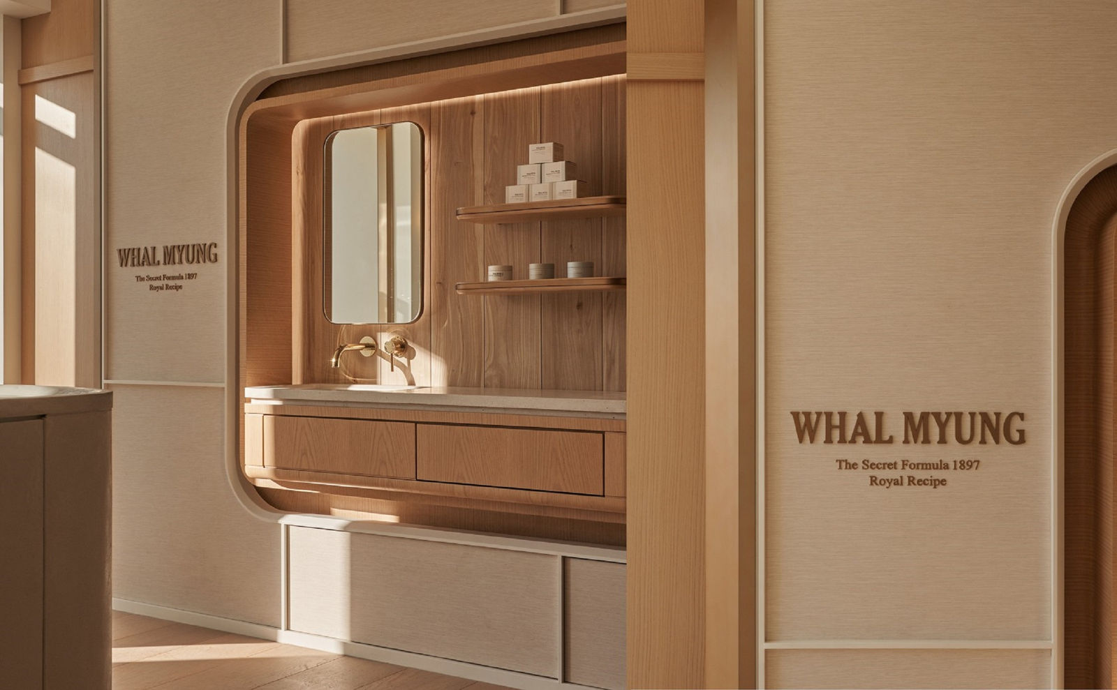
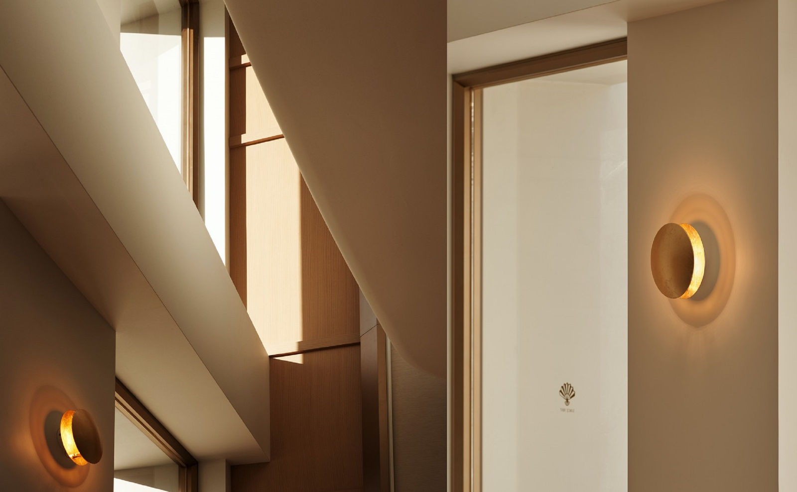
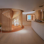
Shades of white have always represented the tranquillity and humility of the Korean nation, and the Whal Myung palette favours a contemporary approach to the herbal medicine manufacturer’s heritage, communicating the image of a premium beauty brand in touch with its roots. The timber spiral staircase is a metaphorical interpretation of the structure of a folding fan, which is the logo of the brand.
![]()
![]()