
Muroran Uzuraen
arica design inc. / Japan
Further images
-
(View a larger image of thumbnail 1
)
-
(View a larger image of thumbnail 2
)

-
(View a larger image of thumbnail 3
)

-
(View a larger image of thumbnail 4
)
-
(View a larger image of thumbnail 5
)
-
(View a larger image of thumbnail 6
)
-
(View a larger image of thumbnail 7
)

-
(View a larger image of thumbnail 8
)
-
(View a larger image of thumbnail 9
)
-
(View a larger image of thumbnail 10
)


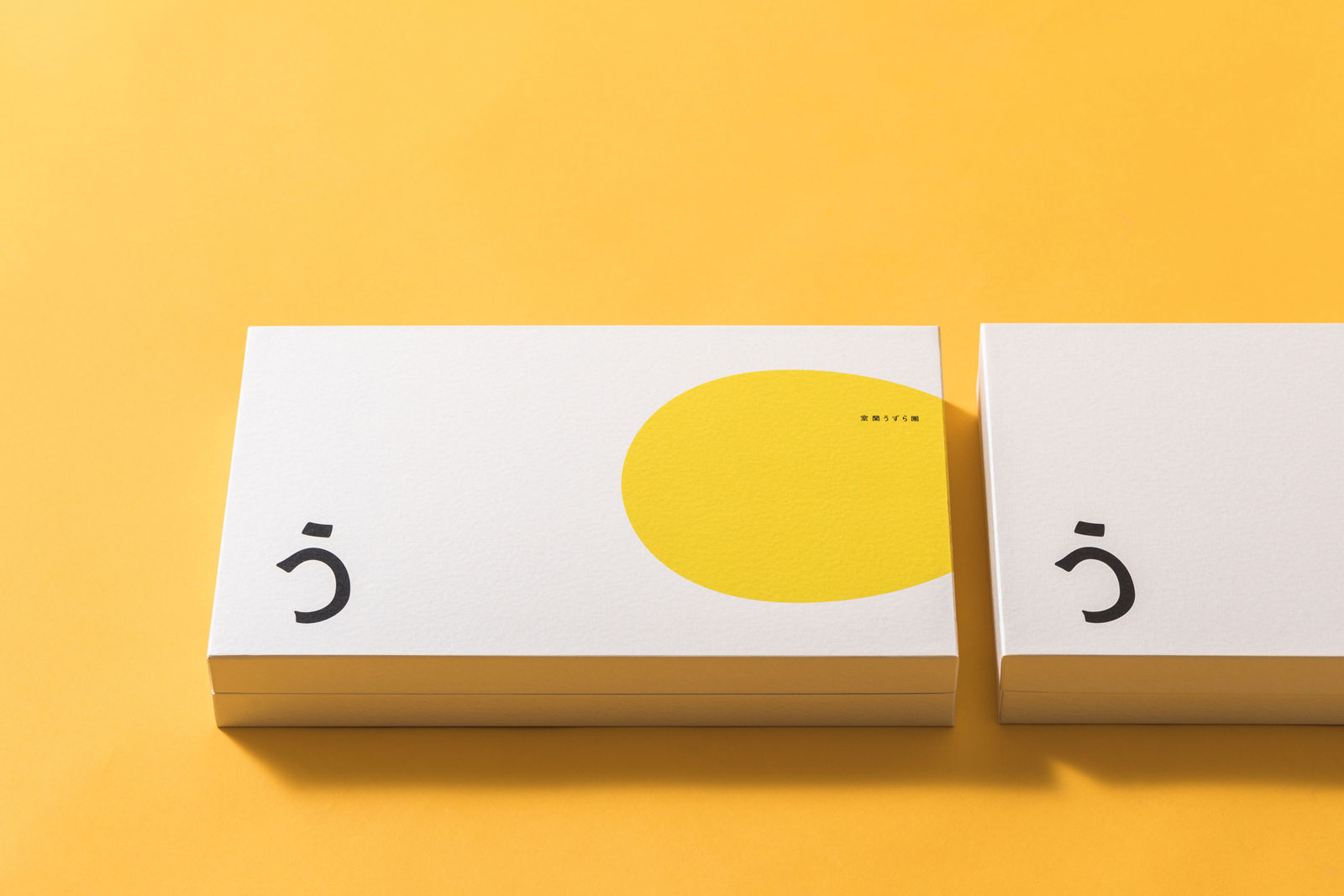
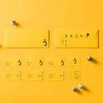
DFA Design for Asia Awards 2020 l Bronze Award l Communication Design | Identity & Branding

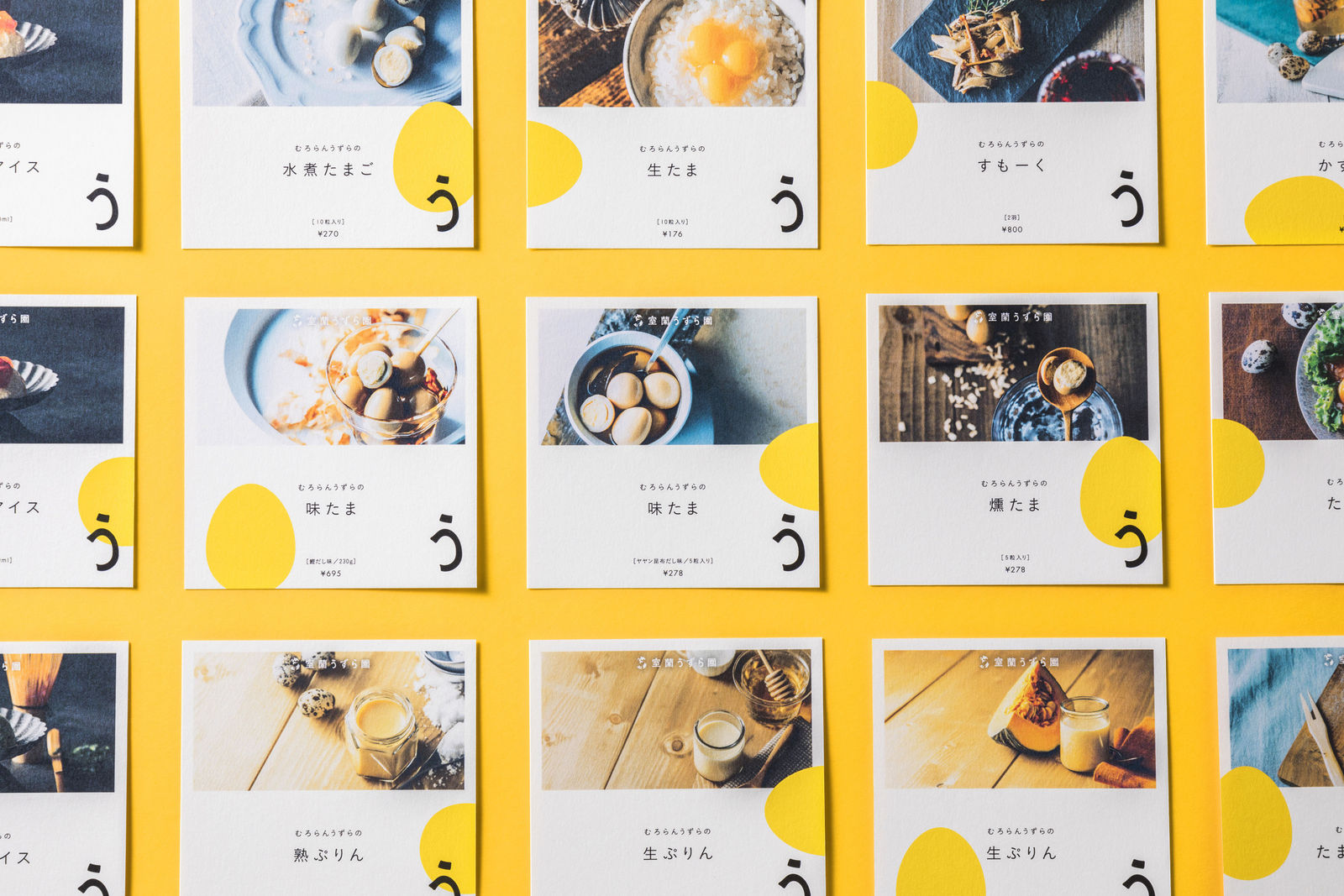
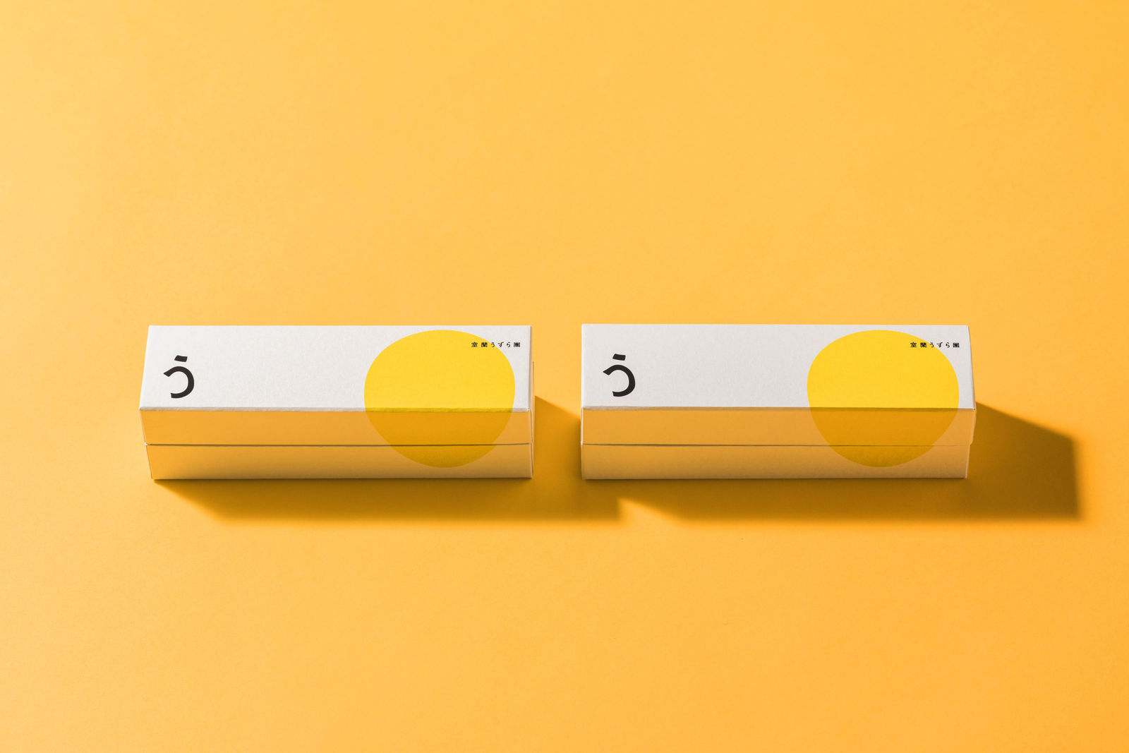
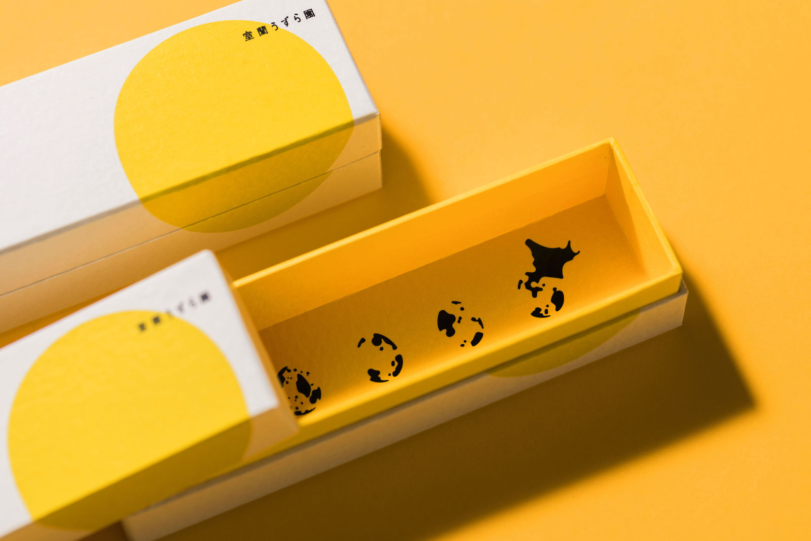
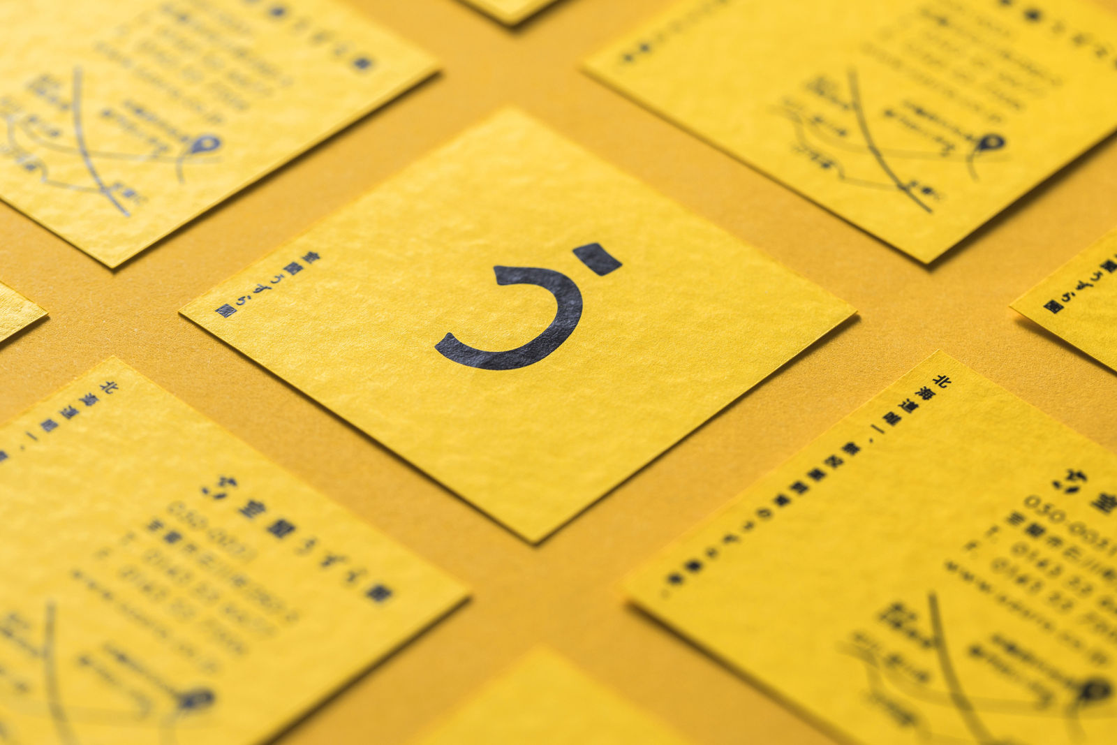
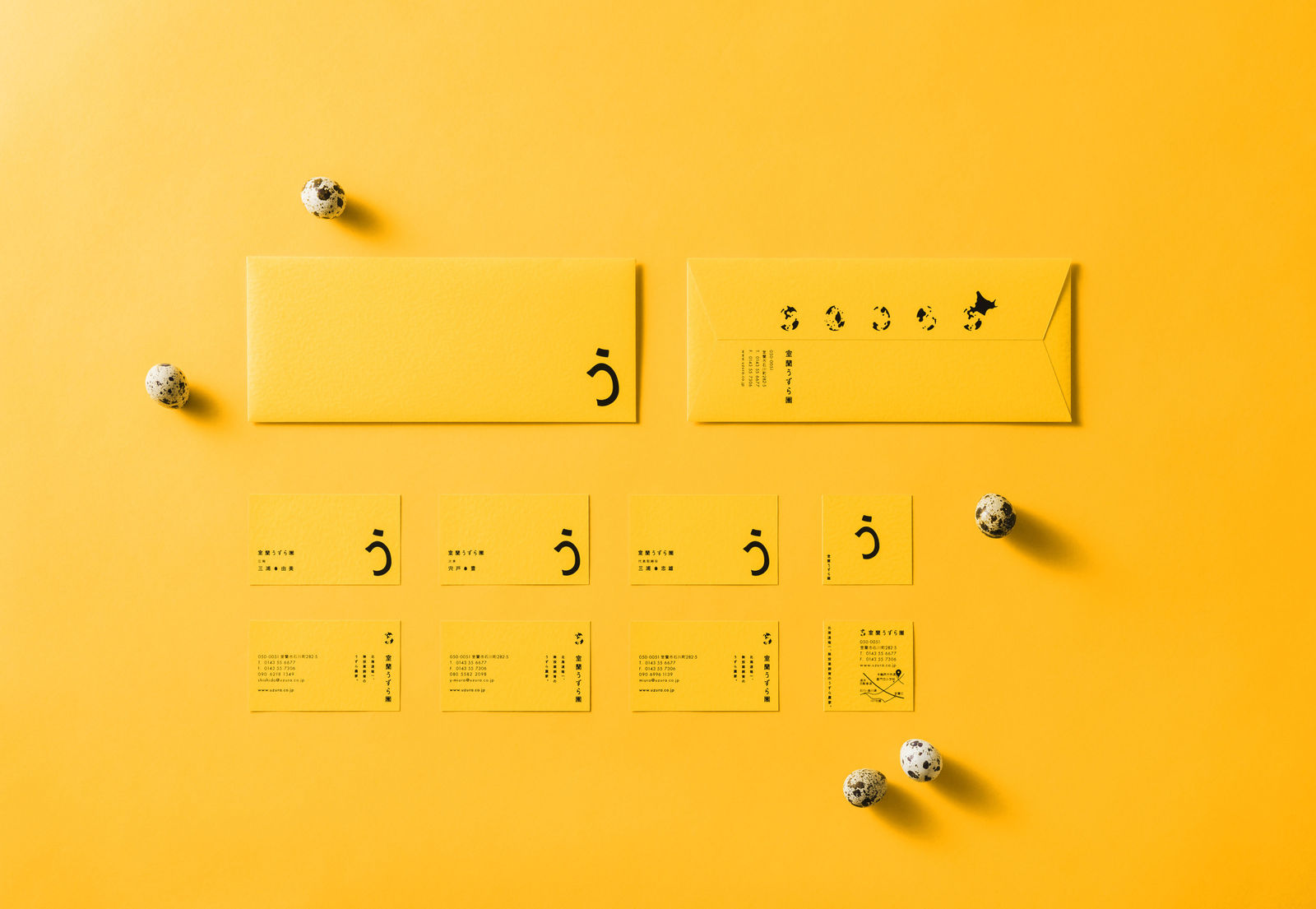
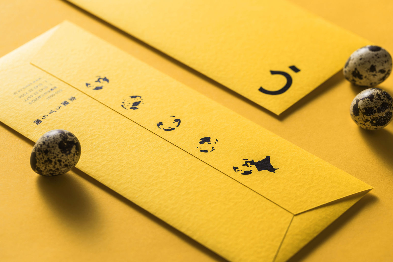
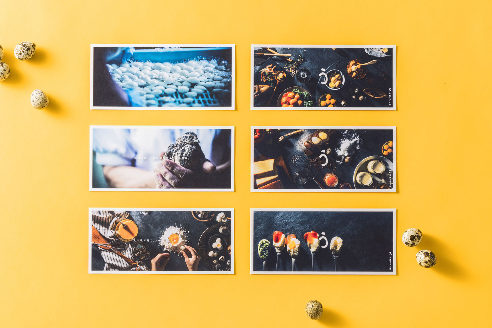
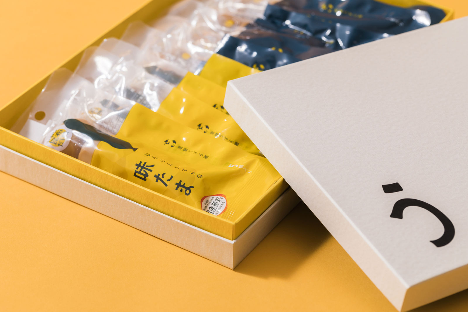
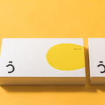
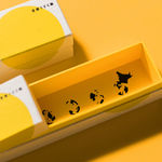
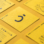
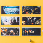
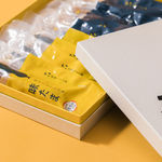
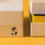
The stylised typography of the Japanese cursive character う is a silhouette of quail eggs. Cards and leaflets reflect the logo, and the packaging also uses quail eggs as a visual in the design, which is also a map to the quail farm. The natural-textured paper used for the packaging conveys the freshness of the organic product.
![]()
![]()