


Sakura Shimizu
arica design inc. / Japan
Further images
-
(View a larger image of thumbnail 1
)

-
(View a larger image of thumbnail 2
)

-
(View a larger image of thumbnail 3
)
-
(View a larger image of thumbnail 4
)
-
(View a larger image of thumbnail 5
)

-
(View a larger image of thumbnail 6
)
-
(View a larger image of thumbnail 7
)
-
(View a larger image of thumbnail 8
)
-
(View a larger image of thumbnail 9
)
-
(View a larger image of thumbnail 10
)


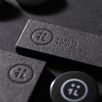
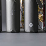
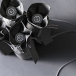
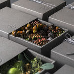
DFA Design for Asia Awards 2020 l Bronze Award l Communication Design | Identity & Branding

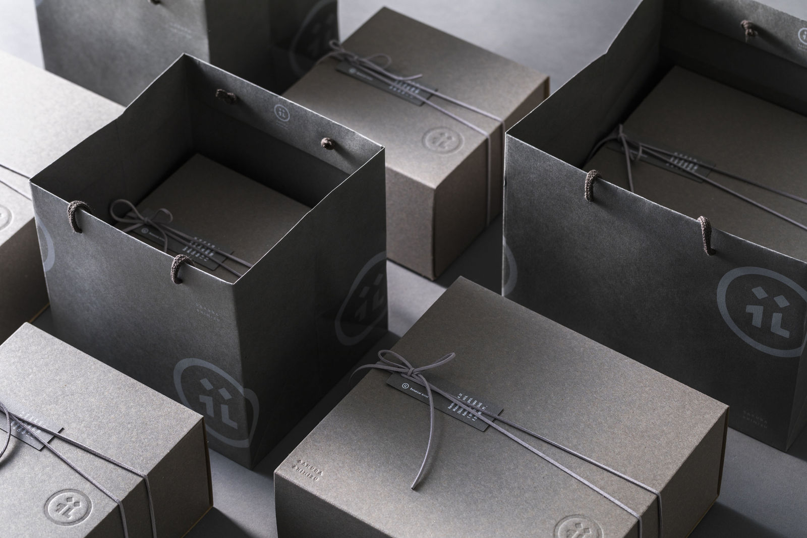
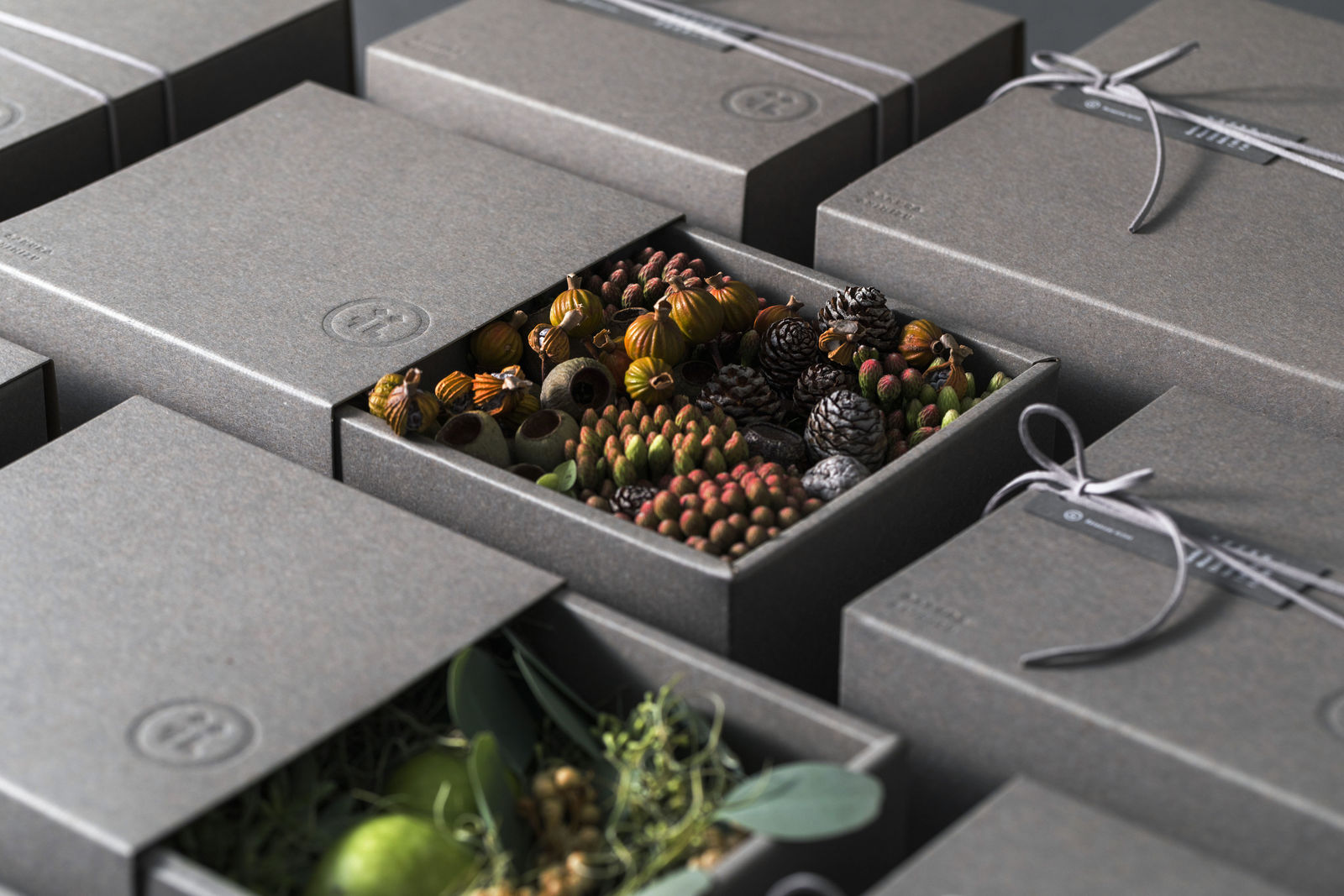
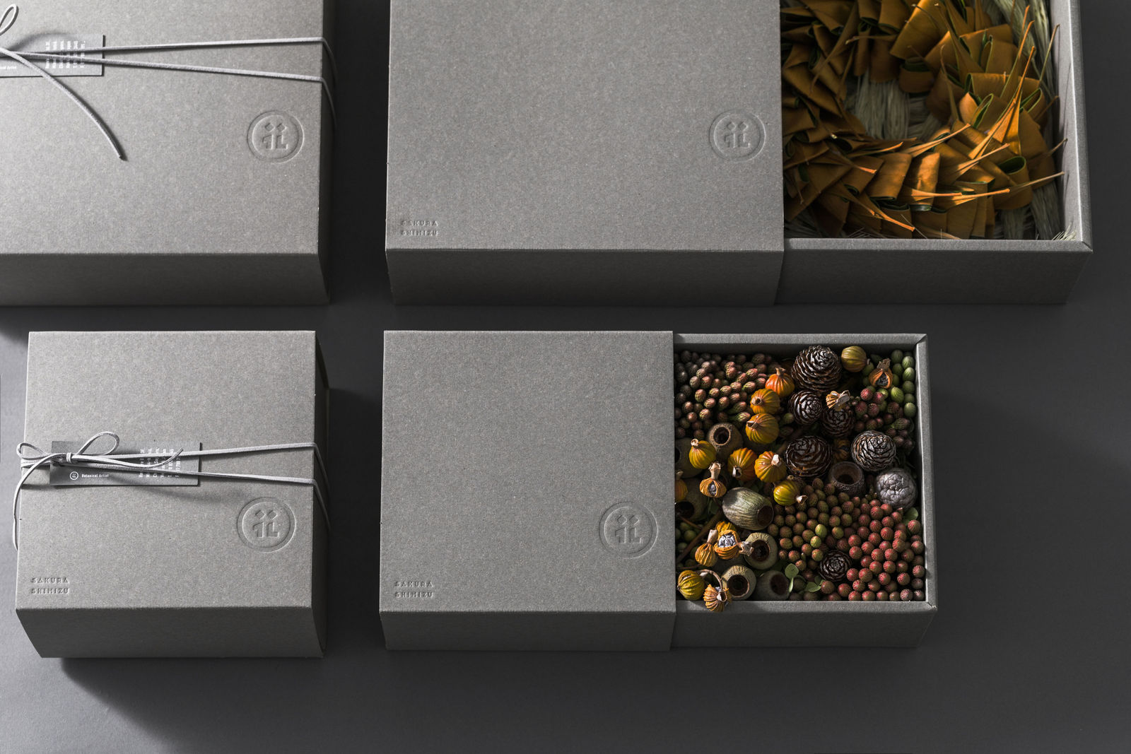
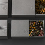
To communicate the floral artist's expertise clearly, a symbol mark uses kanji hana-flower typography, and Japanese elements and clean forms stand out from this anglicised design common among Japanese florists. Grey packaging reflects the philosophy of showing the flowers’ natural beauty by accentuating their vibrant colours.
![]()
![]()