

An Essential Sign for Architecture Design Firm
6D-K co., Ltd. / Japan
Further images
-
(View a larger image of thumbnail 1
)

-
(View a larger image of thumbnail 2
)
-
(View a larger image of thumbnail 3
)
-
(View a larger image of thumbnail 4
)
-
(View a larger image of thumbnail 5
)
-
(View a larger image of thumbnail 6
)

-
(View a larger image of thumbnail 7
)

-
(View a larger image of thumbnail 8
)

-
(View a larger image of thumbnail 9
)

-
(View a larger image of thumbnail 10
)

DFA Design for Asia Awards 2020 l Bronze Award l Communication Design | Identity & Branding

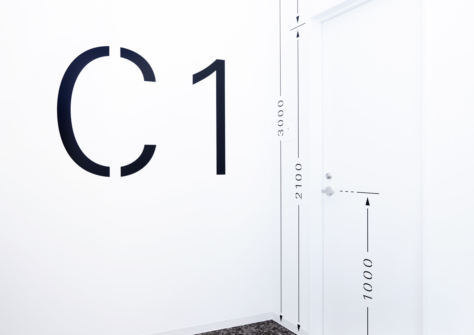
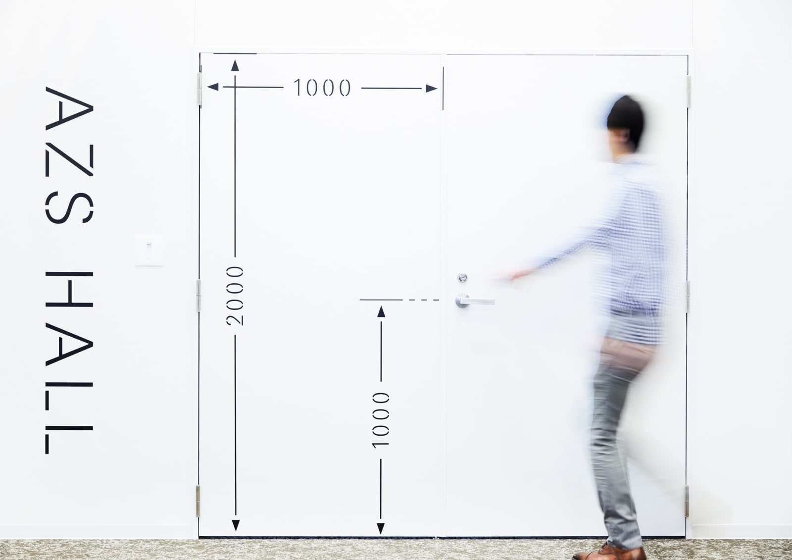
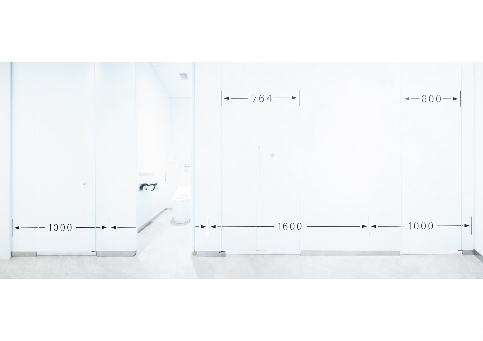
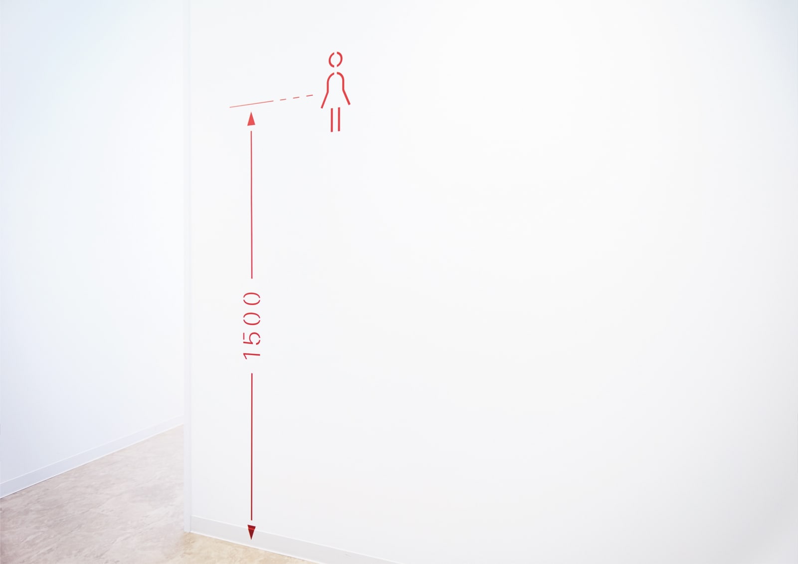
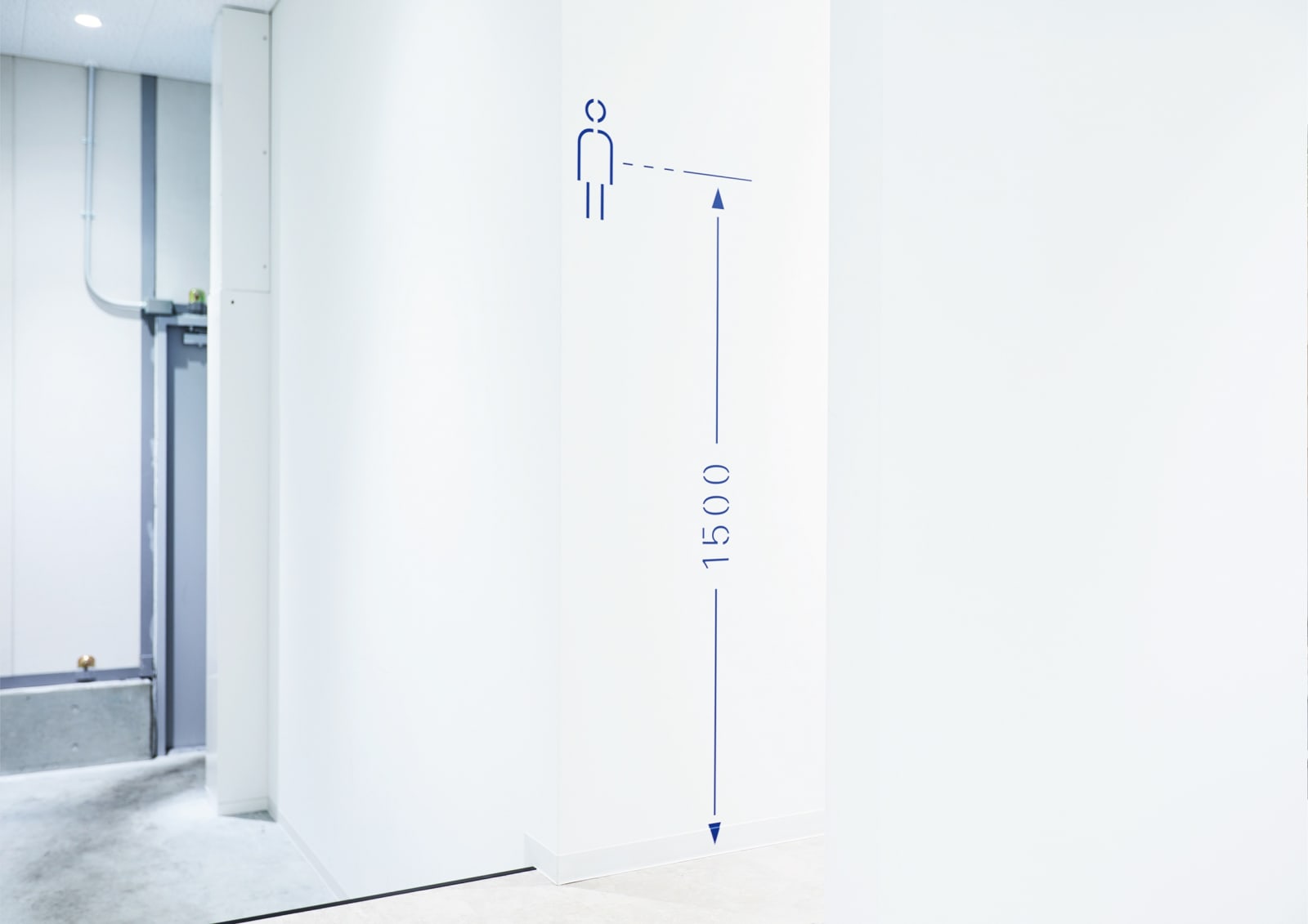
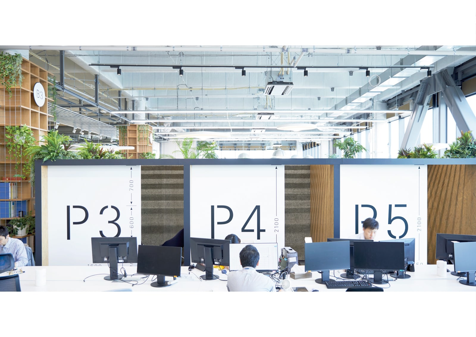
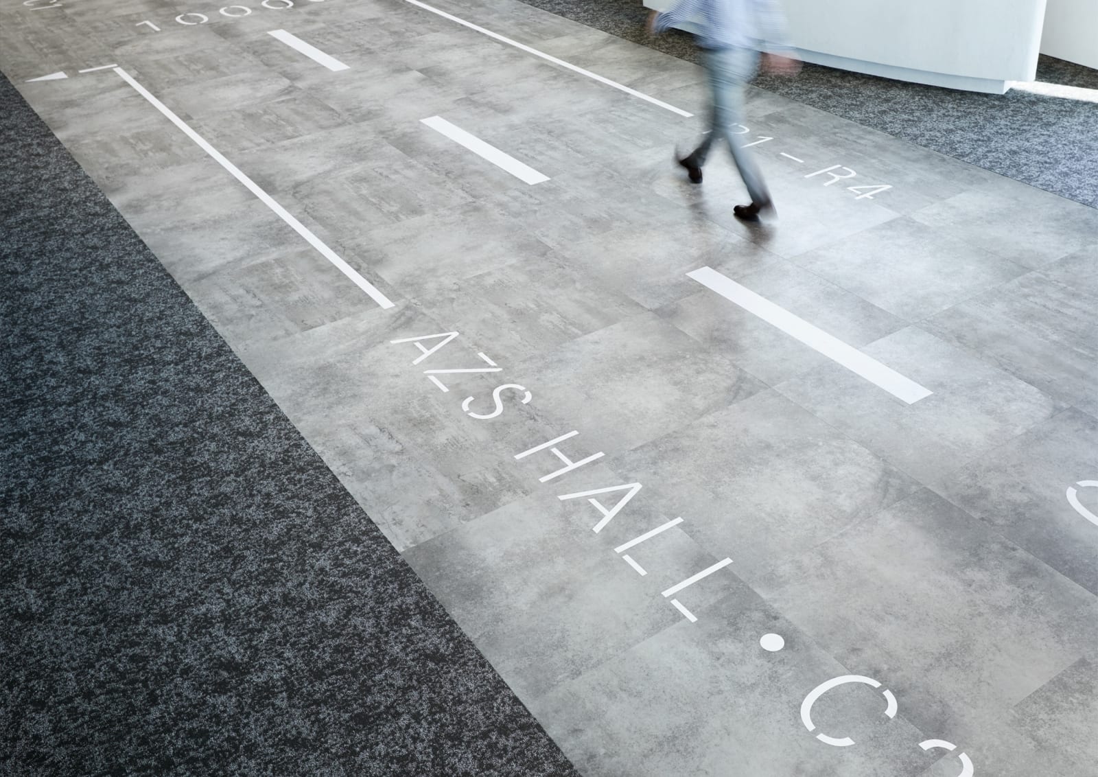
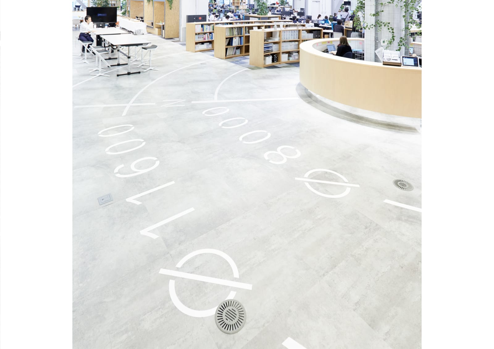
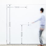
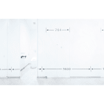
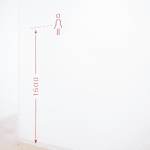
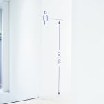
The visual identity for the architect’s new office plays on the importance of proportions and accuracy. The office is transformed into a three-dimensional drawing with signs showing all the measurements, so that black lines perfectly complement the minimalist white interior, acting as eye-catching visuals while communicating the firm’s professionalism in airport design.
