


TOMOE EDO JAPAN
Harajuku DESIGN Inc. / Japan
Further images
-
(View a larger image of thumbnail 1
)

-
(View a larger image of thumbnail 2
)

-
(View a larger image of thumbnail 3
)

-
(View a larger image of thumbnail 4
)

-
(View a larger image of thumbnail 5
)

-
(View a larger image of thumbnail 6
)

-
(View a larger image of thumbnail 7
)

-
(View a larger image of thumbnail 8
)

-
(View a larger image of thumbnail 9
)
-
(View a larger image of thumbnail 10
)
-
(View a larger image of thumbnail 11
)
DFA Design for Asia Awards 2020 l Silver Award l Communication Design | Identity & Branding

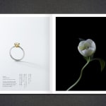
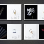
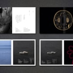
The client is a well-known and highly respected jeweller in Japan, whose visual identity derives from the aesthetics of the Edo period (1603-1868), when art and culture flourished. The rebranding stays true to their ethos of tradition and refinement, and the triple circle in the redesigned logo resembles a ring, but also recalls Japanese traditions and aesthetics. From logos, brand books, store displays and product photography to websites, the studio has executed an effective rebranding campaign.
