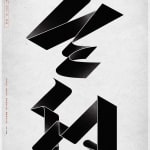


REIWA
COSYDESIGN Inc. / Japan
Further images
DFA Design for Asia Awards 2019 l Bronze Award l Communication Design ▪ Typography

A STROKE OF GENIUS
To celebrate the birth of a new era ‘REIWA’ in Japan, the designer creates a novel typeface of the same name. Merging different strokes together, the typeface turned Kanji characters into eye-catching fluid forms. The added stroke thickness connotes traditional ink calligraphy. The thin white lines create a stark contrast with the thick black strokes, giving the typeface a more contemporary look.
