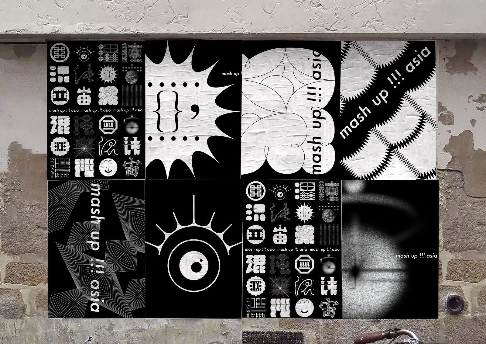
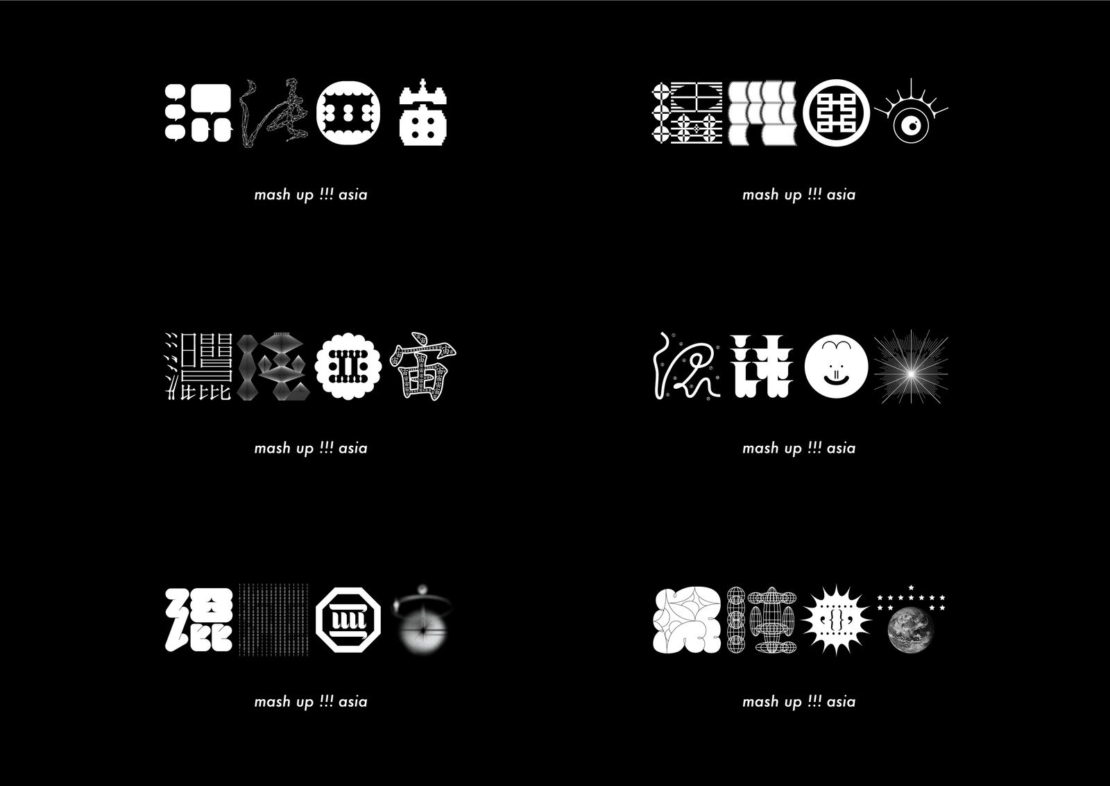


                            mash up!!!asia
                                1983ASIA / Mainland China
                            
                        
                        Further images
                                DFA Design for Asia Awards 2019 l Merit Award l Communication Design ▪ Identity and Branding 
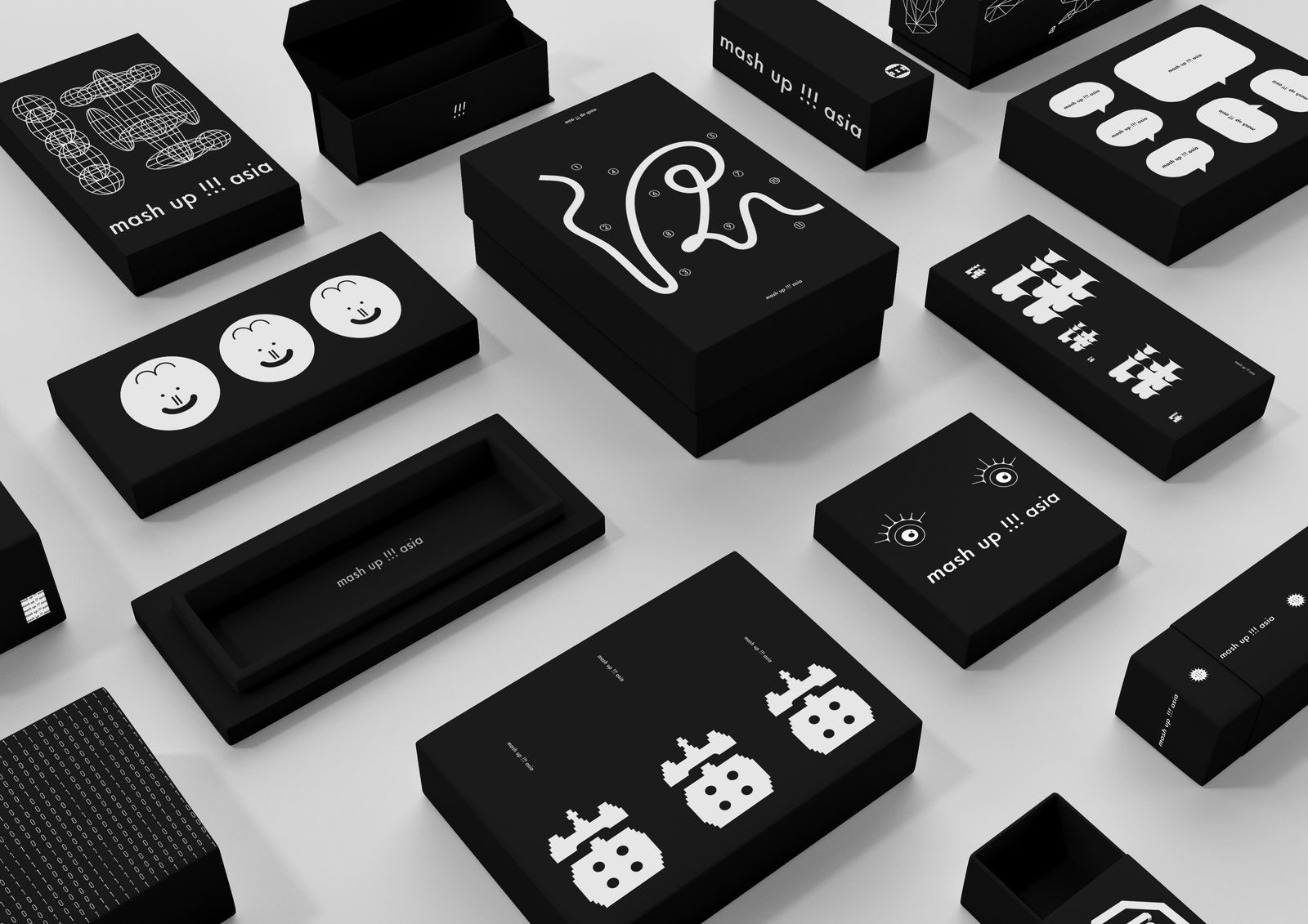
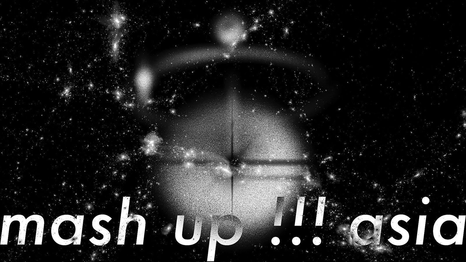
                        
                    
CHAOTIC HARMONY
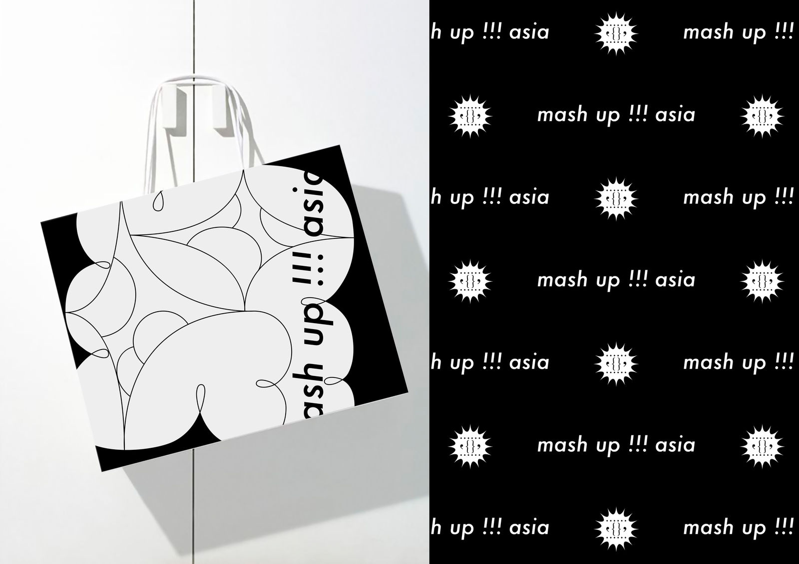
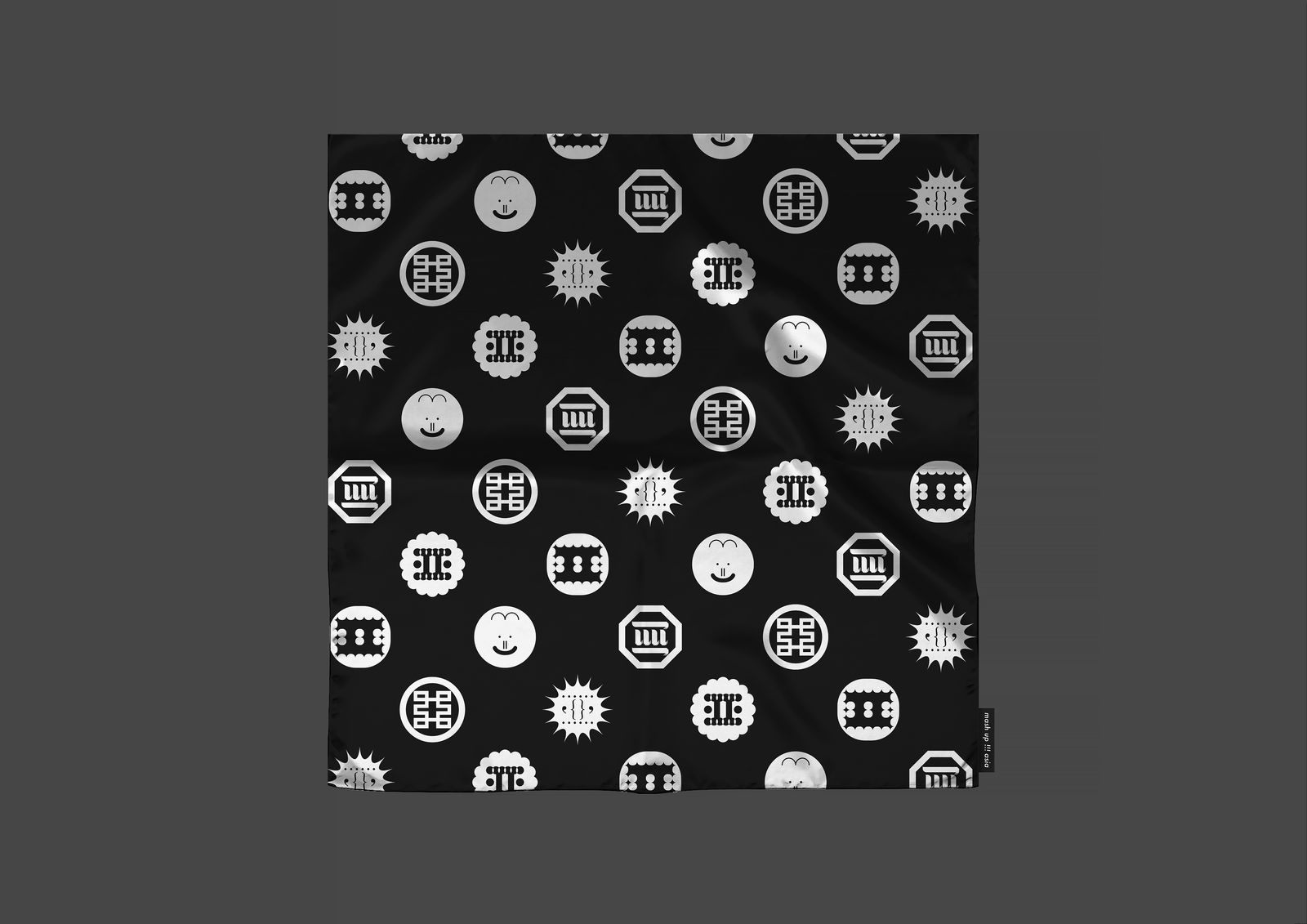
Combining Chinese calligraphy, Tai Chi, Japanese manga and K-pop in its logo, the design acknowledges the diversity of East Asian cultures. Mixing different typefaces and graphic elements, the mash-up aesthetics highlights the youthful energy of the region. The white on black colour scheme hints at metaphysical creativity of the universe.


