New Vision Arts Festival 2021
Further images

how to Cross Boundaries
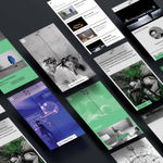
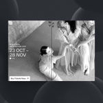
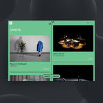
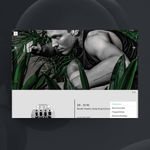
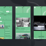
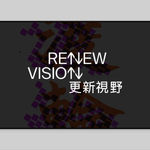
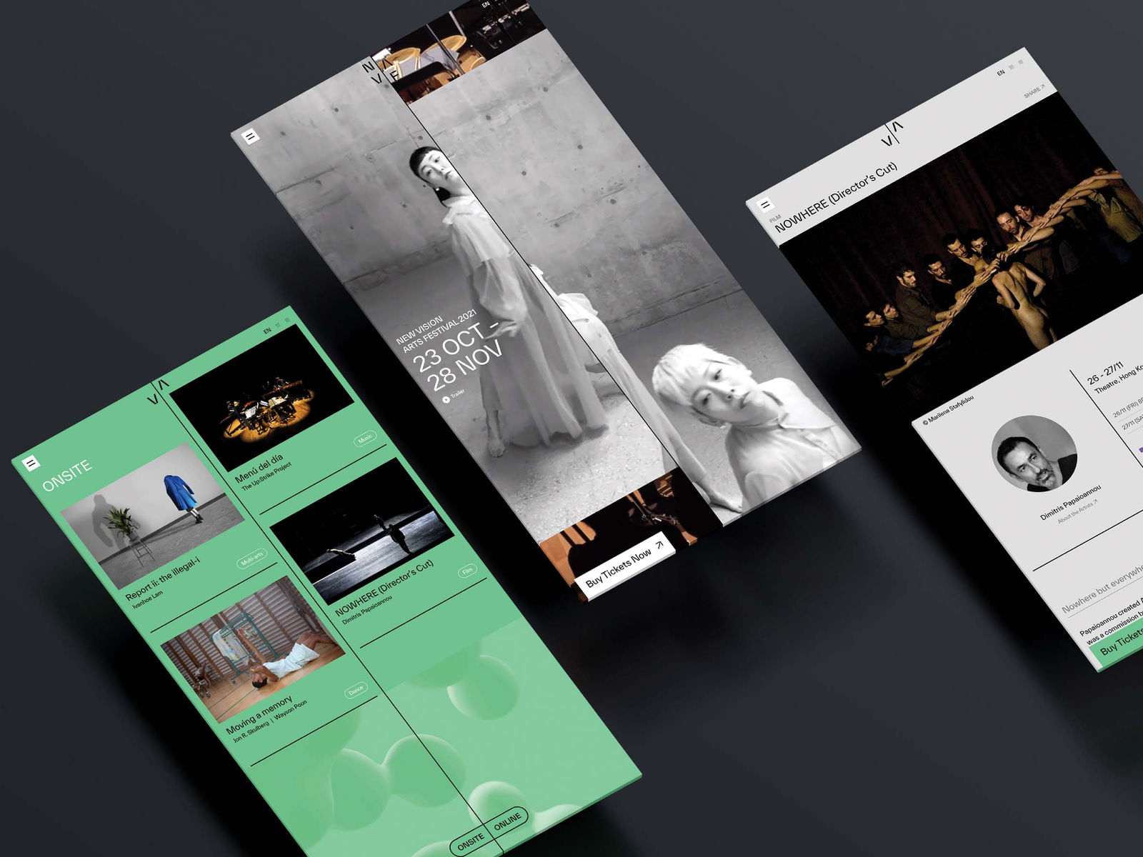
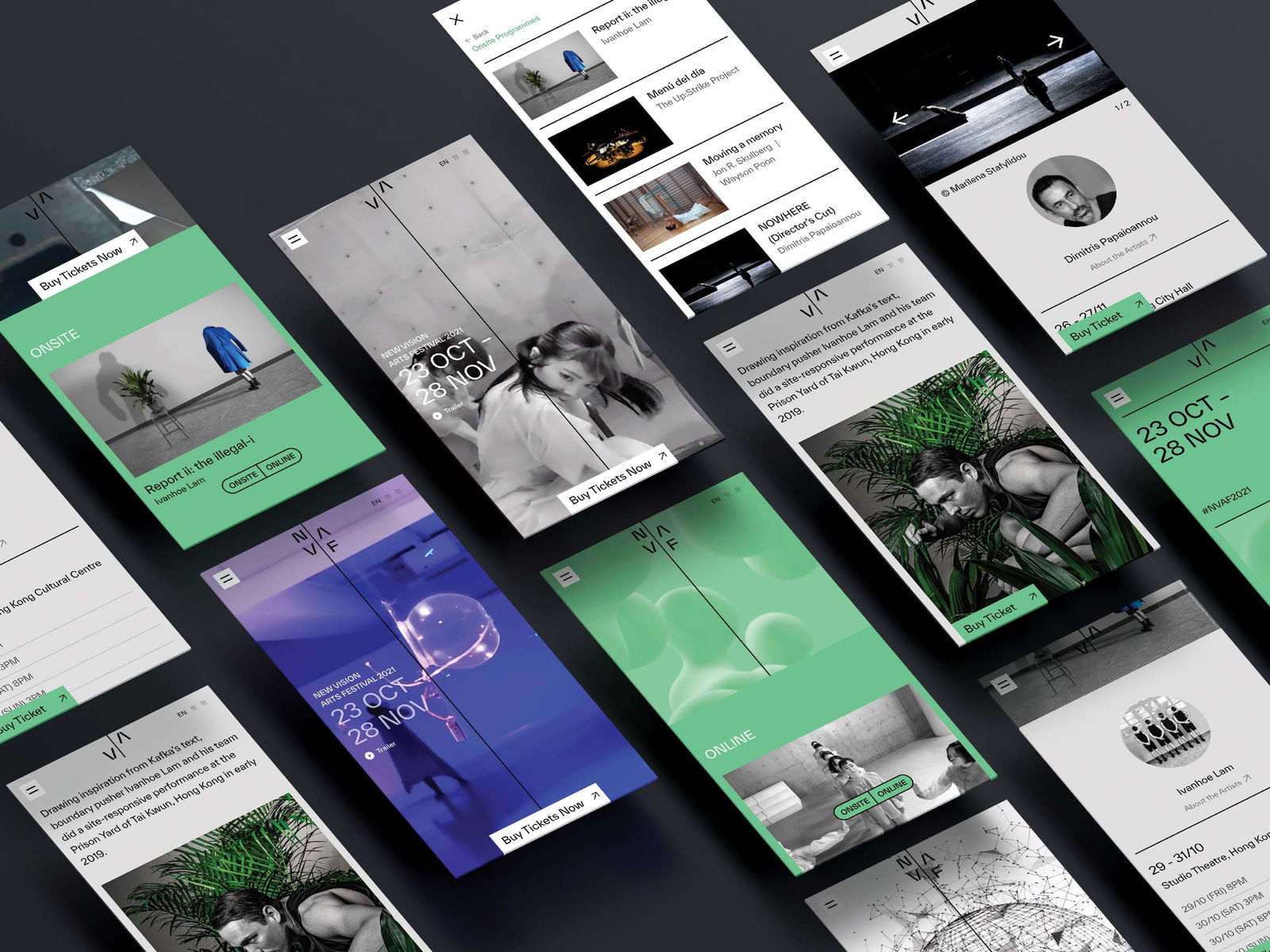
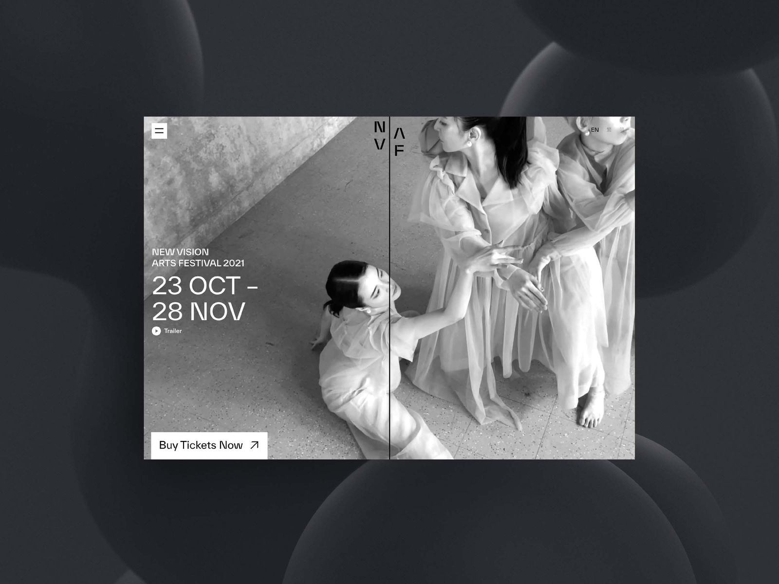
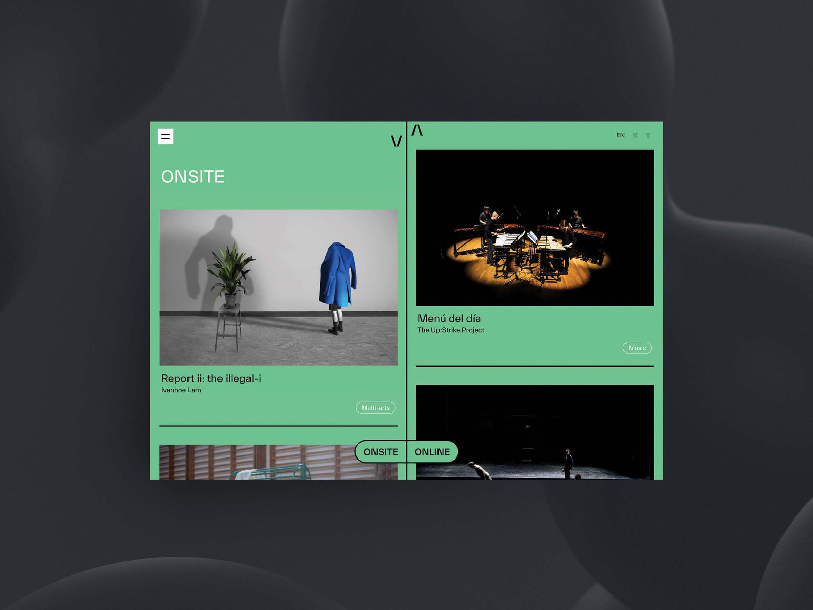
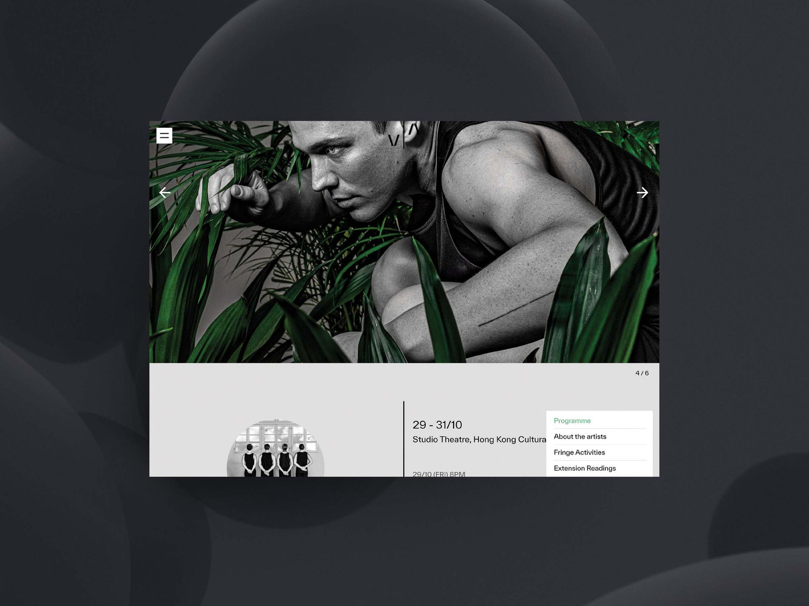
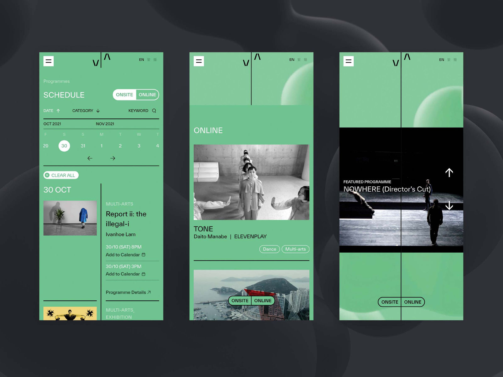
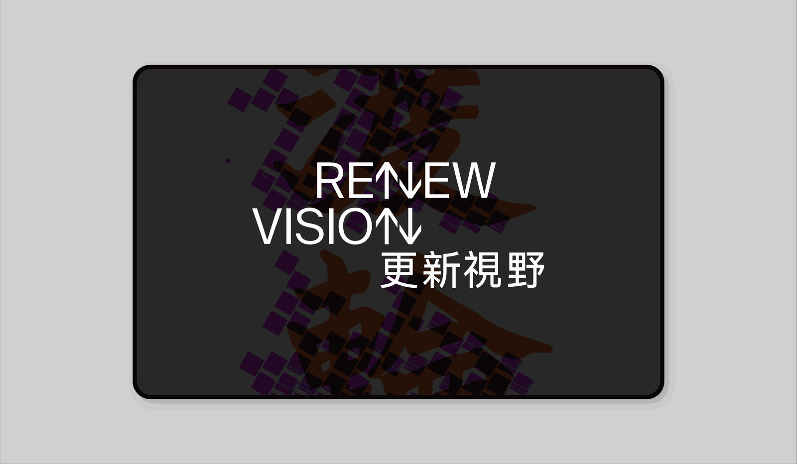
Although severely impacted by the pandemic, New Vision Arts, a respected name in international art circles since 2004, continued to fulfil its mission as a scaled-down online art festival in 2020. Even before that, their brand identity was merely its logo in the corner of the main visuals, but now the festival’s new increased online presence has been branded as “ReNew Vision”, and the logo’s distinctive arrows point to the bold endeavours and adventurous spirit that epitomise the disruptive works exhibited. Despite minimal brand display, key visuals from different works are integrated in the festival’s two-column web layout, and the arrows pointing in different directions guide visitors through an extensive array of work both literally and figuratively, moving far beyond what is being shown. The emerald background is soothing and easy on the eyes, enhancing the overall browsing experience, and conveying hope and optimism. This visual system was further enriched in the 2021 version, when a logotype was chosen for its ability to articulate fluidly in different applications within the website. The horizontal and vertical lines provide flexibility for the festival office and artists to embed content on a page, while maintaining a unified brand look.

