


SHICHIJOKANSHUNDO
HIDAMARI Ltd. / Japan
Further images
-
(View a larger image of thumbnail 1
)

-
(View a larger image of thumbnail 2
)

-
(View a larger image of thumbnail 3
)

-
(View a larger image of thumbnail 4
)

-
(View a larger image of thumbnail 5
)
-
(View a larger image of thumbnail 6
)

-
(View a larger image of thumbnail 7
)

-
(View a larger image of thumbnail 8
)

-
(View a larger image of thumbnail 9
)

-
(View a larger image of thumbnail 10
)
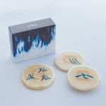


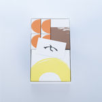
DFA Design for Asia Awards 2022 l Merit Award l Communication Design | Identity & Branding

TRADITIONAL ELEGANCE
This rebranding design for a long-established, Kyoto-based, traditional Japanese confectioner conveys the artistry of homemade desserts. The packaging uses the handwritten kanji character ‘seven’, part of the brand name, as the main visual element, and the logo is used on marketing materials from packaging to promotional leaflets.
![]()
![]()